Our media teacher allowed us to leave the classroom and experiment with lighting. We looked at how the lighting affects the subject of the camera shot at certain angles. For example, when the light comes from behind the subject it makes them appear to be a dark figure (this would be great for more dramatic and dynamic genres of films such as horror) but when the lighting is coming from in front of the subject it highlights them completely making them fully visible to the camera.
If there is insufficient natural lighting there are ways to change this so the lighting is adequate. For example, you could use professional lighting equipment that can light up the subject from any chosen angle or if you don't have access to this you could use other methods (that may be less effective) such as shining light off reflective surfaces and onto your subject using easily accessible items like mirrors or tin foil.
For our filming, we are filming outdoors around midday when the best lighting is available but when we are indoors we will have to consider how we will create good lighting as indoor lighting usually does not look as good on the camera. We will be considering the above methods when we do our filming.
This is an image of Chalkwell Park found on Google maps.
We are going to be filming the majority of the outside scenes in Chalkwell park, mainly because this is close to our first destination of filming and is a perfect fit for the settings we are trying to achieve.
Here's the directions from Chalkwell Train Station to Joe's house and then Chalkwell Park:
The phone call scene will be partially filmed in Joe Dodds' house in his bedroom as well as the scenes involving the conversations with Paul and his friend. We have decided to use this location because it is convenient and nearby close to college, meaning if any extra shots or changes need to be made we can quickly do so. By being nearby college it also reduces the risk of damage to the equipment as it is a short distance from the college. The house also fits the requirements needed for the scene as it is a modern house, which fits into the setting of our trailer. Here is a picture of the house from Google Maps:
Paul is the main character of All You Need Is Love. He's a teenager aged 19, who's romantically linked to Lucy, who he's been dating for 6 months prior to the story. Pauls quite vain and self centered at times, and cares more about himself than anyone else a lot of the time. Despite this, he's still quite a pleasant and charismatic person. He's quite artistic, often writing poems, music and creating art. Paul shows a disregard for others feelings when he lies and changes his mind about plans to ones he supposedly cares about. He's portrayed as absent minded and quite fickle, choosing one girl then another due to one link in common. After starting to listen to The Beatles Paul shows some obsessive personalities. It's clear that Paul is impressionable as he's influenced by his friend on numerous times throughout the film. Despite not caring about each others, Paul is quite emotional himself seen after he visibly regrets a lot of his decisions and is quite sad when he knows he's upset Lucy.
Lucy is Paul's main love interest in our All You Need Is Love. She's a teenager aged 18, who's romantically linked to Paul, who she's been dating for 6 months prior to the beginning of the story. In contrast to Paul, who's quite self centered and vane, Lucy is quite caring of her boyfriends feelings and emotions and cares deeply about him and others. Despite this, we still see Lucy standing up for herself and giving Paul a hard time after he's treated her badly. She's seen as quite clingy and is shown making the effort in the relationship with Paul, when he doesn't. Even after Paul's been clearly interested in someone else Lucy still calls him up eagerly and keeps a check up if their plans are still on. Lucy is portrayed as quite emotional, this is reflected when she's shown visibly upset after being rejected by Paul.
Stella is Paul's second love interest in our production "All You Need Is Love." Although Paul leaves Lucy for Stella and treats Lucy bad due to his new found fondness for her, Stella is still not to be presented in a negative way, as she need to be presented as not knowing about Paul and Lucy's relationship before. This may make her appear as quite naive but it's essential to the plot. Stella is a huge fan of 'The Beatles' and knows a lot of trivia about the band and often recites it or makes reference to the band and their songs throughout the scenes. Stella's quite an upbeat character and is annoyed when others are seen as miserable, shown when Paul is upset about Lucy and Stella tells him to stop being so miserable. This also shows that she's more interested in talking about The Beatles with Paul over thinking about Paul's feelings. This is similar to Paul who doesn't care much about others feelings. Stella is slightly younger than Lucy but only by one or two months, so she's younger than Paul also. Stella is quite a nice person, she's seen making the first effort to talk to Paul and it needs to be established that she's the one who arranges them two meeting up and cares more for the relationship than Paul.
We have to consider the props we need in the film to make our film more realistic and to make sure we have an adequate budget and access to adequate props. We also need to think about how many costumes each character needs as most of the scenes happen on different days in the film and it is unlikely the characters would wear the same clothes everyday.
Paul
Paul will be needing four costumes and three changes which will take place:
Before the shots of Paul & Lucy
Before the shots of Paul being filmed at Joe's house
Before Stella dumps Paul
Paul also needs a few props such as John Lennon-style tea glasses, a drawing of the Beatles, his letter to Ringo Starr written on pink paper, a CD of The Beatles, magazines including a magazine with The Beatles on the cover, a DVD of The Beatles, The Beatles t-shirt, a poster and a phone. The glasses, t-shirt, DVD, magazines, drawing and poster will be provided by Joe, the pink paper will be provided by me and Josh will be using his own phone.
Lucy
Lucy will be needing 3 costumes and 2 changes which will take place:
Before the shots of Paul & Lucy
Before the shots of Lucy being filmed at my house
Lucy only needs a phone for the phone call shots and I can use my own phone for this.
Stella
Stella will be needing 2 costumes and 1 costume change which will take place before she dumps Paul.
Harris
Harris will be needing 2 costumes and 1 costume change which will take place inbetween the shots when Paul and Harris have their two conversations.
As it is winter at the moment, we have less daylight hours which will affect our lighting so we have to be careful about when we film the shots to make sure our shots have the correct lighting conditions. We have decided to film between 11am and 3pm as this is when it is most bright outside and we will start by filming our outdoor scenes where we need the best lighting possible. As some of the shots at Joe's house and my house are meant to be set in the evening, the possibility of it being dark outside does not matter because we will have the correct lighting conditions as well as having lighting indoors.
As well as the lighting conditions, we need to consider the weather as it is cold at the moment and it rains frequently and this could result in hazardous conditions. I have checked the weather forecast for our filming day (Friday, 9th December) and according to BBC Weather it will be mostly sunny and the temperature will be 6°c. This means that our filming can take place then as the weather conditions will be appropriate for the setting of our film as well as not being hazardous to my filming group, the actors and our equipment. However, BBC Weather also says it will be raining the evening before our filming day so the ground may still be damp and weather websites are not always reliable so we will have to consider this and assess the situation on the day of our filming. Ideally we would like to set our Chalkwell Park scenes on dry ground and the best lighting conditions possible so if the conditions are otherwise then we may have to reconsider our filming day in the park but the scenes in Joe's house and my house could still take place.
Lucy
The female protagonist would wear white to imply her innocence and vulnerability. This foreshadows she is oblivious to the hearbreak the male protagonist will do to her. She may also wear a pink as this conveys the universal theme of love, but as its a less strong colour than red; it could insinuate young playful love as opposed to red which is deemed as more passionate. Furthermore, the significance of the protagonist having blonde fits in with symbolism of femininity, whilst also referring to the cliche that "blondes" draw male audiences in. Although Lucy would need to wear either pink or white, it would be crucial to have her dressed in more of a casual attire as well, this will make our production look more legitimate and entice teens to watch it as they will relate to her due to her casual outfit. Not just this but it will make the audience sympathize more with Lucy and view Paul more negatively than before due to their ability to emphasize with her. Baring in mind that the shoot is in the winter and the film is set in the winter, obvious winter clothing is needed for our shoot in terms of legitimacy and believability.
Paul
The male protagonist would wear a darker attire to covey a love for rock music with a emo twist. This will add a slight comical twist as it shows more of a surprise when he starts listening to The Beatles. Once he starts listening to The Beatles he adds elements into his attire to show his fixation with the Beatles memoriabillia. Furthermore, Paul may also wear the colour of blue as this symbolises his mellow attitude to the life and is considered to be a stereotypical male colour, it would be a good idea to wear the John Lennon glasses with blue lenses. Paul could be inclined to have some red in his attire as this symobilses romance and passion. In relation to the male protagonist, it is his passion which leads him to cheat on the female protagonist, but it can also be argued that he is a romantic at heart, this is also seen with his love letters to Stella, the remaining Beatles and his artistic tendancies. Consequently, he would also wear a red mp3 player highlight to the audience his love for music which initially overrides his love for Lucy, this would also be a good idea to symbolize his love for music and the possible danger it has caused his relationships. Baring in mind that the shoot is in the winter and the film is set in the winter, obvious winter clothing is needed for our shoot in terms of legitimacy and believability, potentially Paul could wear a dark over coat/trench coat, popularized by The Beatles in the early 60's.
Stella
The other female protagonist may wear the colour of red, as this colour also symbolises a sense of conflict and danger and in relation to the premise of the film; she is the obstcale that halts the unrequited love between the male and female protagonist. She also needs to be in Beatles esque clothing, such as shirts and braces, this will reflect her love for The Beatles, as well as Pauls.
Paul's Friend
The male protagonist may wear neutral colours such as brown, white or grey to symbolise his status as the voice of reason, due to the fact brown in particular symbolises friendship and this can refer to his loyalty to his friend, Paul.
This is our call sheet which will be handed out to everyone involved in this shoot.
Contact Details:
Melanie Wright- 07856993846
Joe Dodds- 07840998908 Wesley Gyechie- 07900654345
Jordan Matthews- 07453221767
Mollie Lambert- 07008645809
Josh Farrant- 07892334875
Locations:
Chalkwell Park
London Road
Chalkwell, Essex
Joe's house
7 Hall Park Avenue
Chalkwell, Essex
Times
Friday, 9th December 2011
11:00am- collect cameras from South Essex college and meet outside then take the train from Southend Central train station to Chalkwell station together
11:30am- arrive at Chalkwell Park and begin filming
1:00pm- finish Chalkwell park shots and go to Joe's house
1:15pm- arrive at Joe's house and film
2:30pm- finish shots at Joe's house and go to back Chalkwell station
2:45pm- arrive at Chalkwell station and take the train to Southend Central train station
3:00pm- arrive at Southend Central station to return cameras to South Essex College
1. Long Shot - The couple walking down the road holding hands 2. Medium Shot - Couple hanging out sitting down 3. Close Up - Paul and Lucy laughing and looking passionately at each other 4. Medium Shot - Friend introducing Paul to 'The Beatles' 5. Close Up - Paul getting dressed up 6. Long Shot - Paul putting up a poster of Paul McCartney 7. Long Shot - Paul trying on the Sgt. coat 8. Close Up - Paul writing a love letter to Ringo Starr 9. Close Up (shot reverse shot) - Paul staring lovingly at Stella
Act 2
1. Medium Shot (split screen) - Phone call 2. Long Shot - Lucy walking in the local park 3. Long Shot - Paul and Stella having fun 4. Close Up - Lucy looking devistated 5. Close Up (shot reverse shot) - Friend talking to Paul 6. Medium Close Up - Paul phoning Lucy to no avail
Act 3
1. Long Shot - Paul looking sad 2. Close Up (shot reverse shot) - Stella finishing things with Paul 3. Close Up - Paul telling friends he's going to win her back 4. Title 5. Long Shot - Behind Paul and Lucy holding hands
In the first part of the story, the male and female protagonists (Paul and Lucy) appear to be in love. Paul becomes obsessed with the Beatles and appears to love the Beatles more than his girlfriend. This creates a conflict in the relationship causes them to break up. Paul then finds a new love interest, a girl called Stella, and he thinks she is a perfect match for him. However, a split-screen technique shows Stella bitching about Paul. This is juxtaposed with Paul saying good things about Stella. Paul and Stella break up and there is a scene of Lucy feeling sad whilst listening to the Beatles for comfort and she is thinking about Paul. Paul tries to get back with Lucy with comical failures. Then in the end, they coincidentally run into each other and fall in love again.
I have watched a few romantic comedy trailers to get an idea of how the trailers have been created and I will use this information to make my trailer as professional as possible. Here are the two that I think are the most similar to how our film trailer is going to be:
Love Actually
This trailer uses 94 different shots in total (including each cut from a particular shot) excluding the promotion of the production company before the actual trailer starts. This has given me an idea of how many shots my group needs to film for this trailer in order to make it as similar to a professionally made trailer as possible.
This trailer is effective, even within the first 20 seconds. It immediately reminds the audience of the productions that Universal and Studio Canal have created before, and these films are very well-known. This gives the audience the impression that this film is going to be worth watching, like all the previous films this production company has made.
The first shot in the film is an establishing shot of the setting of the film, a city. It is made clear that this film is set at Christmas time as there are pretty lights and a Christmas tree in the shot and a sound effect of Christmas bells is played. Some text comes up in this shot in a white and red font (Christmas-themed colours that are also used for the main title/logo of the film). The next two shots convey the comedy genre of the film, with some of the actors dancing in an amusing way. Then three loving shots are shown with convey the romantic genre of the film. When these five shots are shown, upbeat music is played which makes the trailer fun. Then the first part of the many storylines in this film begins: the Prime Minister and one of his assistants romance. The assistant speaks to the Prime Minister for the first time and she feels like she has made a fool out of herself and this makes her feelings clear. The Prime Minister also looks back at her when he is walking away, conveying that he wants to see more of her. More Christmas-themed shots are then shown with an establishing shot of people ice skating and then a low angle shot of a house with Christmas lights on it and you can see the shadows of some characters removing each others clothes in a sexual way (the low angle shot also conveys how far they are from the ground on the top floor of the house). After these clips, a voiceover man says "when desires are revealed", and then more storylines related to this sentence are revealed including the little boy who is in love and a married man who is having an affair with his secretary while his wife is actually aware of this. Shortly after, the voiceover man says "and chances are finally taken" and then more storylines are revealed including a man who is in love with a married woman but he never told her how he felt (although the fact that the woman is married is not revealed in the trailer) and two people who finally tell each other about their feelings towards each other.The voiceover man says "Universal Pictures invited you" and this is very personal way of addressing the audience, encouraging them to see this film. The rest of the clips are romance or comedy related, once again conveying the genre of the film. The main actors, who are all well-known and recognisable, are acknowledged at the end in their own shots with their names written in the film's recognisable red and white writing. This once again would make the audience want to see the film due to all these well-known actors. The conclusion of some of the storylines is revealed at the end too, such as the Prime Minister going to the woman's house and the little boy seeing the girl he likes at the airport but this does not conclude all the storylines, so the audience would want to know what happened to everyone else as well as why the Prime Minister went to the woman's house and why the little boy is at an airport. The Prime Minister and his assistant sings a Christmas carol to some small children at the end (how small the children are is conveyed through a high angle shot) and this continues to the end of the trailer. More red and white text appears at the end saying "the ultimate romantic comedy coming for the holidays", conveying that this film is the best Christmas film by using the superlative "ultimate". More production information is shown at the end with a black background and white text such as the actors and the companies involved.
The Holiday
This trailer has around 124 different shots in total (including each cut from a particular shot); more than Love Actually. In this trailer, instead of promoting the works of the production company, it jumps straight into the storyline starting with Amanda. The characters are introduced using a split-scene technique with half the screen showing Amanda, the other half showing a white background with blue and black writing- Amanda's name in blue and underneath in black writing, it tells the audience where she lives. This writing is in a serif font and a neutral colour scheme, making the film seem more classy than the fun idea that Love Actually created. Amanda is quite an unconventional female character and this is conveyed when she hits her boyfriend aggressively rather than in a petty way like other romantic comedy films may do, but this adds to the humour. Shortly after this, the second character is introduced and she is called Iris. Her identity is revealed in the same way as Amanda's was: with a white background and black and blue serif fonts. The only thing different is their locations as Iris is from London, England. They are both having problems with their romantic interests and they coincidentally meet each other and switch locations on a holiday. Comedy elements are frequently used in this trailer, such as when Amanda falls over and gets snow all over her. Similar shots are used for the two women conveying their similar lives (for example, the shots when they open their front doors). Like conventional romantic comedies, the two women meet new men in these trailers (however, only one of the women actually gets together with a man- Amanda). Similarly to the Love Actually trailer, this trailer does remind the audience of successful films the director has made before to encourage the audience to see this film too. More clips that convey the comedy and romance genres are shown which further reveal the storyline and towards the end of the trailer, the actors' names are shown using the same split-scene technique and colour scheme used before. The name of the film is shown at the end followed by production details, both in the colour scheme and style of text the used previously just like Love Actually.
Project name: What Happens Abroad, Stays Abroad Genre: Comedy Target audience: Teenagers and young adults BBFC rating: 15 (due to strong language and scenes of a sexual nature) Plot summary: A group of teenagers go on a holiday to Magaluf and various dramatic things happen to them. Trailer moments:
Lots of nightclub scenes with them drinking and dancing
A few mild sex scenes
Key parts of the storyline
Requirements: Camera equipment and editing software Strengths:
Our college is near a beach so the holiday scenes could be created easily
We have access to the appropriate camera equipment and editing software
We have access to actors around the same age as the characters
Weaknesses:
Weather
Low budget (we can't afford professional actors and we don't have access to some equipment that would make our film trailer more professional such as lighting)
Our film is called 'All You Need Is Love' and it is a romantic comedy. We have chosen this genre of film because it is a popular genre of film which appeals to many different ages and both genders. Our film is a romantic comedy because it has a romantic storyline (a boy and a girl in love, the boy goes off with another girl then returns to the first girl in the end) and it will feature comedy elements with exaggerated, dramatic scenarios.
Our film will be BBFC certficate 12 because it may include some strong language. The target audience will be teenagers and young adults but the storyline would be suitable for everyone as it is easy to relate to and entertaining. Our film would appeal to males and females as its forms of distribution will not be aimed at a specific gender. It would be released in February as our film is a romantic comedy and our audience would be interested in watching it due to Valentine's Day being in February.
Our actors will not be well-known so if we were to distribute this it is likely that not as much interest would be shown by our target audience compared to films with well-known actors. However, we have chosen suitable actors to make the characters more effective. We are going to match the costumes to the characters' personalities; for example, Paul will dress like a member of The Beatles to convey his love for the Beatles and the girls will wear colours suited to their personality through colour symbolism.
We have chosen this target audience because it is the main target audience that goes to the cinema and is the main age group that produces the most box office sales.To attract the audience enough advertisement would have to be done. Preferably more on the television and internet as that is what our target audience mostly uses. We also have no particular budget but we have free access to cameras such as the Canon XLH1, a tripod and editing software which is available at college such as Final Cut Pro.
Our locations will include cafes, a girl's bedroom and a boy's bedroom, Southend high street and we will come up with other locations nearer the time. We will have to be aware of the time that we film as we want all our shots to be in the correct lighting conditions.
I was unaware that most of these existed; I have seen Empire and Total Film but none of the others. I am going to research three film magazines, including one I have never heard of before, to familiarize myself with this genre of magazine.
Empire
According to Empire's publisher, Bauer Media, this is the magazine's Audience Profile: "76% Male, Affluent ABC1 movie fans. Smart, sophisticated, opinion leading consumers who are totally tech savvy and always ahead of the curve."
Bauer Media also gives us this description of Empire magazine: "Empire is the world's biggest movie magazine, boasting world exclusives on the biggest and most exciting new movies, and in depth coverage on all aspects of home entertainment. Online, on iPad and in print, Empire's unrivalled access to iconic A-list talent has lead to world beating exclusives such as the first look at James Cameron's Avatar, which went onto be the highest grossing movie of all time, and Spielberg & Jacksons The Adventures of Tintin: The Secret of the Unicorn."
On this front cover, the colour scheme is black, red, brown, white and blue- generally these are masculine colours. The masthead is red so that it stands out against the white background and the other text and images on the cover. Megan Fox is on the cover, a well-known and attractive actress and she is topless, making her look sexually suggestive which would appeal to men and make them want to buy the magazine so they can look at similar photos to this one. The white background of this magazine makes everything on the cover stand out and the photo of Megan Fox has been given alot of space on the cover to make her stand out in particular. The language used includes dynamic verbs such as 'rebooted' and 'sizzling', making the magazine sound more exciting.
Total Film
According to www.theadindex.com, this is the reader profile for Total Film magazine:
75% Male
Average Age 26
Average Income £34,532
Men and Woman 18 - 35
52% regularly go and see a new movie as soon as it is released
Bought an average of 32 DVDs in the last 12 months
As I analysed a Total Film magazine a few weeks ago I already have an idea of what this magazine is like. Similarly to Empire, a masculine colour scheme is used (red, white, grey, blue and red) so it appeals to the general readership audience. Similarly to Empire, Megan Fox is on the front cover but she is associated with a different film. She is in the very centre of the magazine cover, positioned in front of the masthead to make her stand out more. Her outfit is quite revealing which would appeal to a male readership again, however she has blood on her hand conveying that there is more to this film that meets the eye than you would expect by her costume.
Both Empire and Total Film magazines focus on high budget films that would appeal to a large audience, therefore creating a large target readership for the magazines and a larger profit. These two magazines are very well-known and similar, creating alot of competition between them so they would often have to compete for exclusive information about upcoming films in order to be the most entertaining, informative film magazine. As both these magazines' average reader profile is mostly men, the magazines reflect this in the presentation of their front covers. Both of these languages feature superlatives in their language such as 'biggest' and 'most wanted', making the individual magazines seem superior to all other magazines. Both of these magazines feature a white backdrop, making all the text and images stand out more as white is a colour that allows most colours to contrast with it. Both of these magazines feature somebody on the cover, immediately appealing to a larger audience, especially as Megan Fox makes eye contact with the camera and therefore capturing the potential reader's attention.
Sight & Sound
Sight & Sound is a magazine that I had never heard of before. It is published by the British Film Institute every month. I had trouble trying to find the readership profile of this magazine but it is likely to be similar to the readership profile of Empire and Total Film as it is the same type of magazine.
In contrast to my selected magazine covers for Total Film and Empire, the person on the cover of this magazine is male. The colour scheme is yellow, pink, grey and white which would not appeal to a specific gender, perhaps making it appeal to a larger audience. Unlike Total Film and Empire, the masthead is positioned in front of the person which is likely to be because this magazine is less recognisable than Empire and Total Film so the masthead needs to stand out so the readers know what it is. This magazine uses no superlatives and this conveys that the publication is aware that is has stronger competition in the film magazine market.
Today we were taught how to create text that looked like it was on fire using Photoshop and this was the result. Here is how I did it:
I created a new document with 600 x 360 pixels
I set the background layer to black using the paint bucket tool
Using the text tool, I created some text saying 'DIABLO' in white.
I made a new layer above the 'DIABLO' layer by clicking on the create new layer icon.
I set the layer name to 'fire' and merged all the layers to the 'fire' layer with the keyboard shortcut: cmd, alt and shift.
I rotated the picture 90 degrees anticlockwise by using the transform tool
With the 'fire' layer active I used the wind effect in it's default settings three times.
I rotated the picture back 90 degrees clockwise.
I used the Guassain Blur tool and set the radius to 1.5 pixels so I could make the wind effect look less harsh.
I adjusted the image's hue and saturation to 40 (hue) and 100 (saturation).
I duplicated the 'fire' layer by dragging it to the create new layer icon. This created a new layer called 'fire copy' which was identical to 'fire'.
With 'fire copy' active, I changed the hue to -40.
I set the mode of 'fire copy' to the mode Colour Dodge and merged the layer down onto the 'fire' layer.
I used the Liquify filter to make the flames more realistic. I set the brush size to 50 and the brush presure to 40 and created some flame-like shapes. I then changed the brush size to 30 and the brush pressure to 35 and created some smaller flames.
I moved the original 'DIABLO' text layer to the top of the layers and set the colour of the text to black.
I used the Rasterize tool on the 'DIABLO' text layer, zoomed in and used the Polygonal Lasso tool to make cuts in each letter. This made the text appear cracked.
As the black lettering was too dull, I added some more colour and texture by adding a drop shadow to the 'DIABLO' layer. I set the Blend Mode for the shadow to Multiply and the colour to #b75c0b. I added an Inner Bevel to the 'DIABLO' layer with a highlight colour of black and a shadow of #844600. I finally added a Colour Overlay with #f57300. This gave the illusion of the text blending in with the fire.
I then duplicated the 'fire' layer once again and placed the layer 'fire copy' at the top of the layers.
I set the mode of 'fire copy' to Screen with alt, shift and S. Then I added a layer mask by clicking on the Add Layer Mask icon at the bottom of the layers palette.
With the linear Gradient tool, I ran a black to white linear gradient from the of the text area to the bottom.
I used the smudge tool to toggle with a 65 pixel brush at 70% on the layer mask, dragging up and down to reveal and hide the flames.
For this textual analysis I am going to look at other genres of film trailers as I have already analysed some horror trailers but it's important that I develop my knowledge of other genres too.
The Last Song
Genre: Drama/Romance The Last Song was produced by Touchstone Pictures and features a well-known actress, Miley Cyrus, who would attract a large audience. The production company is acknowledged briefly at the beginning of the trailer as the non-diegetic music in the trailer begins and it is mentioned again towards the end of the trailer. As I have seen this film many times, I do have a strong understanding of the storyline, the characters and the soundtrack. This trailer appears to reveal a lot of the storyline, however, the clips from the film have been put in a different order to how they take place in the film, making the storyline in the trailer slightly different. For example, when Ronnie (Miley Cyrus) reads the letters from her dad at the beginning of the trailer, in the actual film she doesn't read these letters until near the end of the film. Many of the transition effects between the film clips fade in and out, giving an impression of the audience reflecting back on a memory which frequently happens in the film. As well as the film's production company, the trailer also acknowledges that this film is a film adaption of Nicholas Sparks' novel, The Last Song. This is actually shown on the trailer for longer than the production company was, conveying that this is more important. Slightly later on, text comes up in the trailer with the same effect saying 'author of THE NOTEBOOK'. The Notebook is a well-known, popular book and film so this is likely to attract an audience. The music being played in the trailer changes a third of the way through when the romantic part of the storyline gets introduced- the music went from a casual song with guitars to a gentle, romantic song being played on the piano, completely changing the atmosphere of the trailer. The romantic clips stop and the trailer refers back to the relationship between the dad and his son, with the same song playing. The song then changes again to the main song on the film's soundtrack, 'When I Look At You' by Miley Cyrus, and the romantic clips begin again setting a mood. More hints of what the storyline is about are shown as text flashing up in the trailer such as 'a story about SECOND CHANCES', 'FIRST LOVES', 'AND THE MOMENTS IN LIFE...' and 'that lead us BACK HOME'. The title of the film is shown just before the end, this is a typical convention of any film trailer. The trailer finishes with an establishing shot of where the film takes place with text over the top of the clip acknowledging the production company, four of the actors/actresses, who created the music, the co-producer, the producers, what book the film is based on, the director and who did the screenplay as well as a few brands which contributed to making the film such as Kodak and DOLBY Digital.
I think this film trailer is effective because it acknowledges all the things that would attract a large audience such as the author that wrote the book it is based on and the well-known actress, Miley Cyrus. It also reveals enough of the storyline to make an audience interested in seeing the film.
The Inbetweeners Movie
Genre: Comedy
This film is based on a popular television series on Channel 4 called The Inbetweeners. As this television series already has a large audience, this film is likely to receive a large audience as it already has public interest. The film company associated with Channel 4, Film 4, is acknowledged at the beginning of this trailer. Film 4 is a well known film company and television channel so this would immediately catch the audience's attention. The production company, Bwark Productions, is also introduced which is already associated with The Inbetweeners television series. For half of the trailer, it introduces the storyline of the film in order. This contrasts with the trailer for The Last Song which put the clips in a different order, revealing less of the true storyline to the audience. For the other half of The Inbetweeners Movie trailer, it shows humorous clips from the film which would make the audience laugh and make them want to see more of the film. Text comes up in the trailer occasionally in the recognisable Inbetweeners font which helps to contribute to the audience's understanding of what the film is about. Half way through the trailer, it tells the audience that the film will be released 'this summer', which would be a convenient time for the film to be released because the film itself is set in the summer. Establishing shots are frequently used to convey the settings of the film. Similarly to the trailer for The Last Song, the title of the film is not shown until the end but when it is shown it is in the same font as the previous text, the easily recognisable font from The Inbetweeners television series. Another similarity to the trailer for The Last Song is how particular companies and individuals are acknowledged at the end of the trailer such as the actors and producers.
Harry Potter and The Deathly Hallows Part 2
Genre: Fantasy/Thriller/Drama
This film is a sequel to Harry Potter and The Deathly Hallows Part 1, so it is likely that the audience watching this trailer have seen the first part and they would understand the second part. As the characters are assumed by the production company to already be known, the characters' individual personalities are not introduced as much as the characters in The Last Song trailer, like The Inbetweeners Movie trailer. The storyline picks up where the first part of the film left off, giving no detail of what happened previously so for this trailer to be effective, the audience would of had to of seen part 1 of Harry Potter and The Deathly Hallows.
The beginning of the trailer is captivating as it plays the well-known Harry Potter theme tune slowly, and for each note of this theme tune that is played, a clip from the film appears- this creates a very eerie atmosphere. The lighting throughout the majority of the trailer is very dark, creating a night-time vibe, a convention of the thriller genre. When the theme tune ends, the film's production company, Warner Brothers Pictures, is introduced but it is in a black and grey colour scheme. Usually the Warner Brothers colour scheme of their logo is gold and blue but the black and grey colour scheme is used to add to the dark, mysterious atmosphere being created in the trailer but as the Warner Brothers logo is so well-known, the audience is likely to still be familiar with the production company as it has created popular films. Dramatic orchestra music begins to play whilst the Warner Brothers logo is being shown, then clips of the film begin to be shown with an audio clip of Voldemort, a main character in this film, being played over the top. The visual clips being shown are relevant to what Voldemort is saying, developing the audience's understanding of what he is saying. The music then becomes more dramatic and more dramatic clips are played. As this film comes under the fantasy genre, much of this film is edited with effects such as adding a realistic-looking dragon and fire to some clips which is difficult to create through just capturing the footage on a camera. The film's release date is shown in the well-recognisable Harry Potter font. More text also appears in the same font, revealing more of the storyline and more of Voldemort's audio is used like a voiceover. The background music becomes increasingly dramatic, creating a more intense atmosphere. The music ends just before an intimate clip which features Harry and Voldemort begins and this is done for dramatic effect but as soon as this clip finishes, the dramatic music begins and more of the film's clips are shown- this is done twice. More text appears in the Harry Potter font which really flatters the film, using words like 'epic' and 'worldwide phenomenon', making the film appear outstanding and superior to other films. At the end of the film there is a crashing glass sound effect which conveys that it is the destructive end of the trailer, and the title of the film appears in the Harry Potter font. 'The Deathly Hallows' flashes up with a lightening bolt effect which is relevant to the well-known lightning bolt scar on Harry's forehead. Then the text 'COMPLETE THE JOURNEY IN 3D' appears- 3D films are very popular at the moment so this would appeal to the audience more and by using the phrase 'complete the journey', it gives the representation that this film will complete the audience's life. The date of the film's release is repeated in text form, and cinemas that are showing the film are displayed as well as the production company and the film's website- all this information is again shown in the Harry Potter font.
This film comes under the action, adventure, sci-fi and thriller genres. Conventions of these genres are all found in this trailer. As this film is a sequel, the audience are likely to already be familiar with the characters shown in the trailer. However, if the audience hasn't seen the previous film, they are likely to be familiar with the actors anyway as they are well known (e.g.Shia LeBeouf and Megan Fox).
In the first clip, it makes the audience aware that Sam (Shia LeBeouf) is going to college and not bringing Bumble Bee (the robot), revealing part of the storyline. This clip is also humorous as the robot dances to music, but this sound is diegetic- it hasn't been edited in to the film. The non-diegetic music does not begin until the production company, Dreamworks, appears on the screen. The Dreamworks clip has not been edited in any way to suit the film visually, but this institution is very recognisable to the audience as it has produced many other well-known films such as War Of The Worlds and Shrek. Then the second production company is shown, Paramount, which is also recognisable to the audience due to films such as Sweeney Todd and I Love You, Man. The trailer then shows a establishing shot, showing the university, and this introduces one of the film's settings to the audience. The dialogue from his mother in this clip continues throughout three shots, conveying the significance of the clip for setting the scene. This dialogue is also seen as humorous when Sam's father responds to his mother and at this point the music suddenly ends to create a dramatic effect. Then different music begins as the trailer switches to another setting featuring Sam's girlfriend, Mikaela (Megan Fox), another main character. She is lying in a position on a motorbike that males would find sexy, appealing to a male target audience, especially seeming as she is wearing revealing clothing. Dialogue from a different scene also plays over this clip, conveying that she is his girlfriend. This dialogue continues throughout multiple clips of Mikaela (at a motorbike shop) and Sam (at college), showing the audience that they are apart. Then in the last clip in this sequence, the music and the dialogue stops as a small metal shard hits the ground, conveying the significance of this shard to the film. This metal shard also has a close-up shot adding to the importance of it as it catches the audience's attention. When the metal shard lands, a glowing effect is edited into the clip and robotic noises are played, adding to the sci-fi genre and the theme of robots. As Sam examines this shard, flashback effects are used to create a mysterious vibe and the camera zooms up close to his eye suddenly revealing a robot and ancient textual markings inside which has clearly been edited. Robotic sounds are played again. This also gives an insight into significant parts of the film's storyline whilst not revealing much about it. In the next set of clips when Sam thinks he is going mental, the same mysterious text is seen glowing above his book which has been edited in, and dialogue about what is going on in his head is playing over the shots revealing more of the storyline. More science-fiction conventions then begin to be shown when you see the clip of stars shooting in space and the clip of the main robot, Optimus Prime. This is the first time he is introduced in the trailer and there is a voiceover to make it appear that the robot is speaking. The size of the robot is conveyed in the first shot of Optimus Prime as it is a low angle shot, making the robot appear much larger than Sam. This also makes Sam appear small and weak compared to Optimus Prime. More edited clips are shown when the stars and a robot fly through buildings and boats with appropriate sound effects, making the film's action and thriller genres clear. No music is played, only sound effects, which adds suspense to the clips. As the trailer goes on, more of the storyline is revealed and it progresses, using more establishing shots to show more settings of the film and there are dramatic drumming noises which are conventions of the action genre. More and more clips of the robots are shown, conveying that robots play a significant role in this film. As this film is sci-fi, the majority of these clips have been edited to make them appear to be realistic.
Just over half way through the trailer, the trailer acknowledges Michael Bay, the director. This has been edited in and the font of the writing is metallic, adding to the robot theme of the film. Then many short clips are used parallel to each other with no transition effects, creating a dramatic effect. The amount of settings in this film are also conveyed. Then the trailer acknowledges the executive producer, Steven Spielberg, a very well known producer who produced films such as E.T and Back To The Future. His name is also shown in robotic font. More clips are shown with dramatic non-diegetic music but this ends when Sam shouts "OPTIMUS!", then a flashing transition effect is used, and a clip of Optimus Prime crashing to the ground is shown. The music ending and Sam shouting create a dramatic effect for Optimus Prime's fall, a convention of the thriller genre. Then a significant quote of dialogue by Optimus Prime is played over two clips that are also of importance to the film's storyline with no music played, drawing attention to the quote. After this, many action-themed clips are shown with flashback transitions between each clip and the change of clips gets faster and faster with a high pitched sound (often found in the thriller genre) getting higher and higher which builds a lot of suspense. The final film clip shows a huge robot sucking up lots of the desert while humans hide from it for protection. The extravagant editing of this clip creates an intense ending, especially when a robot is about to be taken into the bigger robot's mouth- this leaves the audience in suspense as they will want to know what happens next. Before the audience get the chance to see the robot get destroyed, the title of the film appears in metallic font, building itself like the way the robots transform in the film and metal-themed sound effects play. 'REVENGE OF THE FALLEN' then appears under 'TRANSFORMERS' in a smaller font, conveying that this film is a sequel. Then this text explodes and the Transformers logo appears, also appearing like it is made of metal. At the end of the trailer, some other details of the film's production are shown but they only flash up quickly, conveying that the audience does not need to know this information as the important people (Steven Spielberg and Michael Bay) have already been acknowledged previously. All this text matches all the other text used previously; a metallic font conveying the robot theme.
I think this trailer is effective because it reveals just enough of the storyline to make the audience interested, and the extravagant editing which has been done is exciting and realistic. Conventions of all the genres are conveyed and all the main characters are acknowledged so the audience will understand what type of film this is and who the important characters are. I think this film would appeal to males because the action, adventure, sci-fi and thriller genres are usually aimed at males and the Mikaela is attractive so the males would want to see more of her. The ending of the trailer creates suspense and as some of the storyline has already been revealed, the audience would want to know how the film ends. The well-known producers acknowledged in the trailer would also appeal to an audience because they would expect the film to be good due to the familiar names.
Codes and conventions are the rules and regulations of how to make the standard format of a media product.
Conventions are what you would expect to find in a media product and where; this includes:
Types of articles
Where you would expect the articles to be
Types of images
Amount of images
For magazines, this would include double page spreads (this would include conventions like big pictures, title, both pages on the same topic, standfirst, articles, columns and pull quotes), front covers (this would include conventions like a masthead, barcode, price, issue number, date, pull quotes and images).
Codes are anything purely visual that creates meaning. This includes features such as pictures, colours, layout and font (serif or sans serif).
This information was taken from a hand-out we were given by our tutor:
Task 1: Research Blog
The blog must be used to provide an analytical account of how I plan to complete all of the requirements of this coursework. The blog should detail the marketing of at least three films, devoting entries to:
the analysis of trailers (how and why they work, shots used, how the narrative is compressed, what is shown/not shown, how it is edited to appeal to a market audience etc.)
analysis of any print-based marketing material (how do you capture the tone and content of a film with a single image? what style is used? how are elements such as colour and text used to support and communicate with the tone of the film?)
synergy with other companies/products (is there any merchandise connected with the film? Does the film work with other companies in promotion?)
Analysis of the skills you are developing through your research
I must make sure that my blog includes a range of media such as videos, photos, audio files and links to other useful articles.
Task 2: Electronic Press Kit
I need to create an electronic press kit for a film that I have devised containing the following:
poster (PDF or JPEG)
press release and synopsis
trailer
marketing images for use in magazines including a mock magazine cover
I also have to update my blog with any planning and preparation I complete:
scripts
storyboards
requirements
schedules
test footage with an explanation and commentary
rough footage with an explanation and commentary
outtakes with an explanation and commentary
potential music
potential sound effects
examples of influential works and how they helped me form my ideas
sketches and designs for my poster
magazine cover ideas
Task 3: Evaluation
I must update my blog with an evaluation of each aspect of this assignment ensuring that I discuss:
how useful my research was in finding out how film marketing works and the creation of my own electronic press kit
the strengths of my electronic press kit and any areas that need developing whilst comparing them to professional works
summarise the skills I have learned in the completion of this assignment
I must include audience feedback and how I respond to it.
In a media class we learned how to give text an icy effect in Photoshop CS5 using many different tools. This was the most complicated text editing I have done and I learned many new skills.
Firstly, I created a Photoshop document with 640 x 480 dimensions and I filled in the layer black with the paint bucket tool. Then I used the text tool to write my name in white writing and the font, Georgia. This text usually works better with a thick bold style but I wanted to be experimental. I rotated the canvas 90 degrees clockwise then used the wind option under filter and stylize to add a windy effect to my text before rotating my text back 90 degrees anticlockwise. I then used the facet tool under filter and pixelate to edit the hue, saturation and lightness of my text (Hue= 210, saturation= 60 and lightness= 0) and I made sure colourize was selected. Then under blending options in layer and layer style, I changed the settings on bevel and emboss to:
Style: Emboss
Technique: Smooth
Depth: 150%
Direction: Up
Size: 10px
Soften: 0px
Then I proceeded to create an outer glow:
Blend mode: screen
Opacity: 50%
Noise: 10%
Range: 20%
Jitter: 0%
I had to repeat some steps to create a better effect on my text due to my font choice and this was the finished result:
In my media class we studied the codes and conventions of film posters. I chose to analyse the poster for Transformers 2 as it is one of my favourite films and the poster is captivating. These are the codes and conventions I found:
Codes:
The colour scheme is dark- this shows that the film's target audience is likely to be boys
The font looks metallic which suits the theme of robots in the film
The desert in the background is one of the settings in the film, giving the audience an insight into the film
The photos of flames and smoke convey that it is an action film
The layout is quite simple and spaced out so the audience can see the poster clearly
The photo of the two main human characters running conveys that it is an action film
The way the robots are positioned makes them appear tough and intimidating, adding to the action theme
Conventions:
Shows the main characters
The title is large and it stands out against the background
Shows the release date and information about the people/companies involved in production/distribution
In media we were taught how to use the text, transform and lasso tools. I was already familiar with these tools because I used them last year and at GCSE so I found this task of creating a magazine cover using a single image simple. As I had some free time after, I added a barcode, a date, the issue number, the website, a price and some headings to make it look like a more conventional magazine cover. This is how it looked before:
In class we learned how to use the clone stamp tool and the zoom tool. I was unfamiliar with the clone stamp tool but I quickly understood how to use it. I had used the zoom tool on many occasions and using these two tools together we edited this image:
This is an old, dusty photo. After using the clone stamp tool and the zoom tool, I was able to remove any unwanted marks and this was the result:
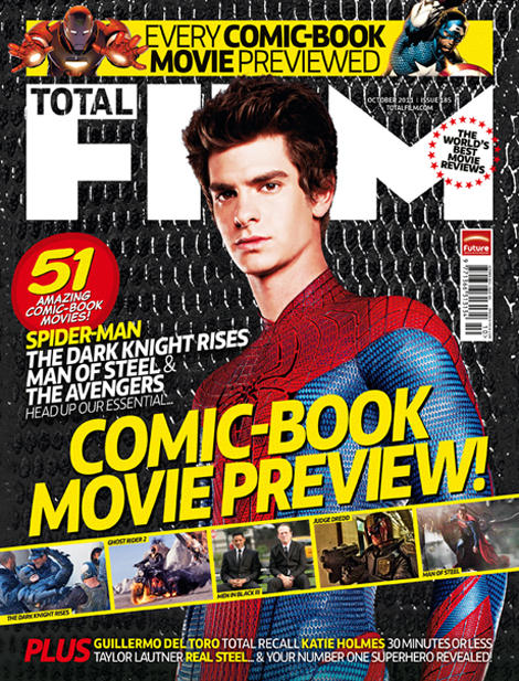
We had to study this magazine cover in a media lesson. This is the front cover of an issue of Total Film with a superhero theme. Here are some of the codes and conventions I discovered:
This magazine has a person on the front cover and this makes the reader more likely to buy the magazine, especially because the actor is making eye contact with the camera, catching the reader's attention
This Spiderman film is new and exciting, therefore people would want to learn more about it so by making Spiderman the main feature of the front cover, this will attract a larger audience
Spiderman is a familiar, well-known superhero so the audience would recognise him
The colours used (red, yellow and white) contrast against the black background, making the magazine cover stand out
The quote "world's best movie reviews" is a hyperbole- it is the 'world's best' but this would make this magazine appear superior to other film magazines, making the reader more likely to choose to buy this magazine
The front cover has a superhero/comic book theme- it uses photos from comic book films and the text used is the sort of text you would find in a comic book
The target audience of this magazine is likely to be boys due to the use of masculine colours and male superheroes
Stars are symbolic of fame and superiority so by putting stars around "world's best movie reviews" it adds to the effect that this magazine is superior
The magazine's publisher/institution can be found next to the barcode so people are aware who this magazine is published by
The smaller photos placed across the magazine cover look like a comic book strip or a film reel, giving a comic book/cinematic effect
There is small print of the actors in some superhero films and the more well-known, significant ones are in yellow so they stand out and catch the reader's attention
We have been looking at film trailers in our media lessons so we can explore some of the conventions used and get inspiration for our trailers. I often find horror trailers really captivating so I have decided to analyse some and these are some trailers I found particularly appealing:
This is the trailer for Paranormal Activity 2. I think this trailer is effective because it does not give away much of the storyline so the viewers would want to know more about it. They show clips of the audience watching it which the viewers can relate to and this would encourage them to watch it and see why this audience were so afraid. This trailer uses clips that make the viewer jump which is one of the typical conventions of a horror film, making the genre of this film clear. The use of a video camera effect to film the trailer reveals to the viewer that this film is created by a video camera to give a home-made video effect. There is no music used in the trailer which is very unconventional for a trailer but it creates tension and suspense which suits the effect the film's genre wants to give.
This is the trailer for Sorority Row. This trailer contrasts with the trailer for Paranormal Activity 2 because it gives the audience an insight into the storyline whilst not giving too much away. The first 40 seconds of the trailer give the impression that this film is a completely different genre to what it really is because it shows a group of girls enjoying their last days of school, then it takes a big twist when one girl dies and more and more horror film conventions are conveyed as the trailer progresses such as using clips that would make the audience jump and using a minimal amount of music to create suspense.
This is the trailer for Halloween, released in 2007. This trailer is similar to Paranormal Activity because it does not give much of the storyline away. This trailer uses a voiceover instead of music which encourages the viewer to want to see the film as he makes it sound more exciting and intense. It uses similar conventions to the other two films such as scenes that make the audience jump and lack of music. It is clear that this film is a horror film because most of the clips used include an intimidating character, harmful props such as a knife and lots of screaming.