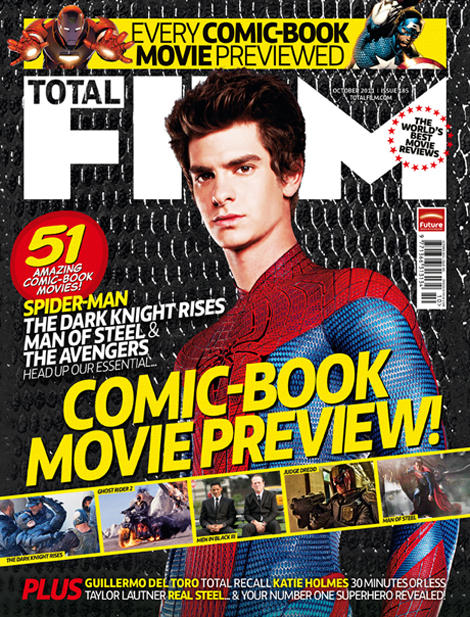
We had to study this magazine cover in a media lesson. This is the front cover of an issue of Total Film with a superhero theme. Here are some of the codes and conventions I discovered:
- This magazine has a person on the front cover and this makes the reader more likely to buy the magazine, especially because the actor is making eye contact with the camera, catching the reader's attention
- This Spiderman film is new and exciting, therefore people would want to learn more about it so by making Spiderman the main feature of the front cover, this will attract a larger audience
- Spiderman is a familiar, well-known superhero so the audience would recognise him
- The colours used (red, yellow and white) contrast against the black background, making the magazine cover stand out
- The quote "world's best movie reviews" is a hyperbole- it is the 'world's best' but this would make this magazine appear superior to other film magazines, making the reader more likely to choose to buy this magazine
- The front cover has a superhero/comic book theme- it uses photos from comic book films and the text used is the sort of text you would find in a comic book
- The target audience of this magazine is likely to be boys due to the use of masculine colours and male superheroes
- Stars are symbolic of fame and superiority so by putting stars around "world's best movie reviews" it adds to the effect that this magazine is superior
- The magazine's publisher/institution can be found next to the barcode so people are aware who this magazine is published by
- The smaller photos placed across the magazine cover look like a comic book strip or a film reel, giving a comic book/cinematic effect
- There is small print of the actors in some superhero films and the more well-known, significant ones are in yellow so they stand out and catch the reader's attention
No comments:
Post a Comment