Wednesday, 18 April 2012

Storyboards


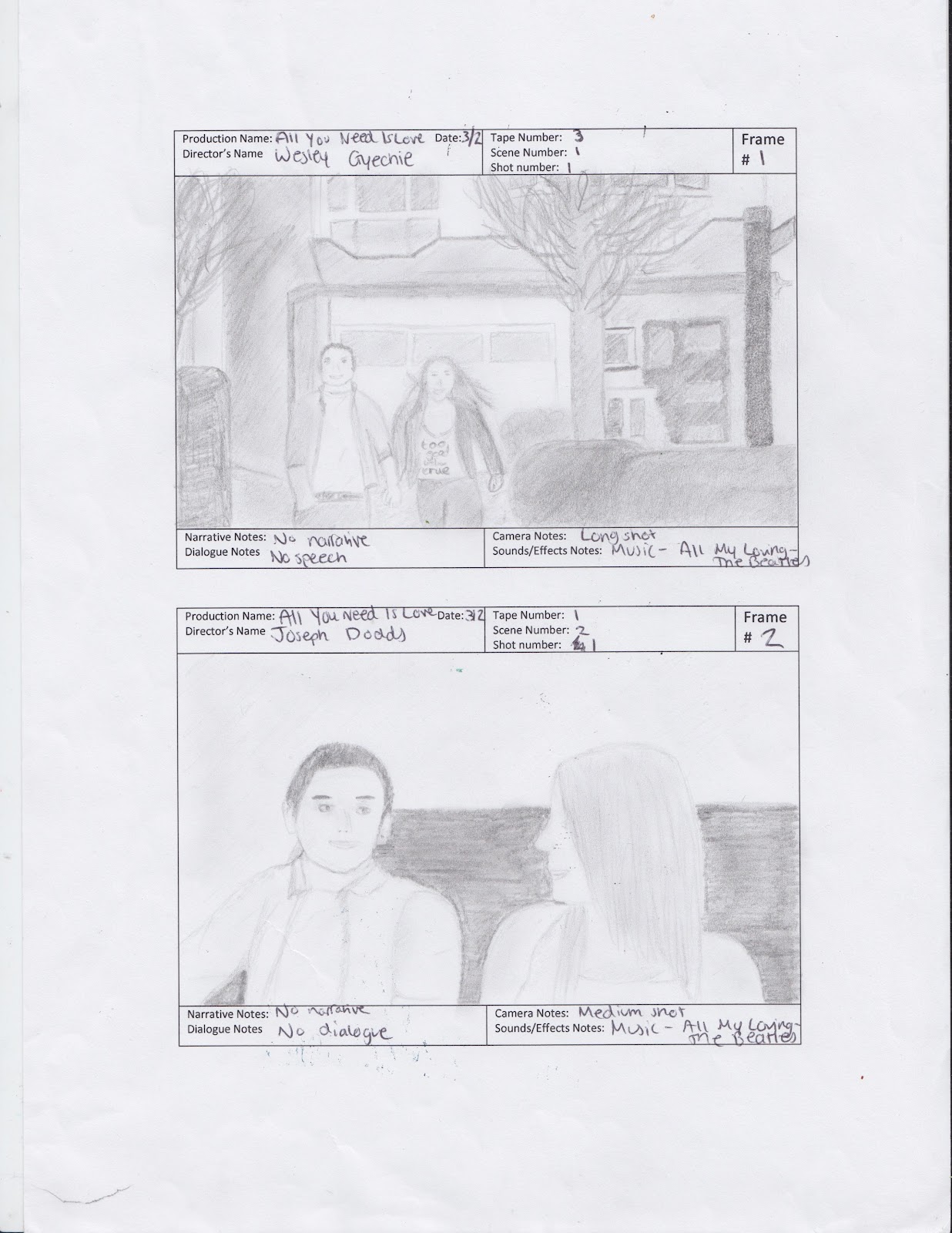
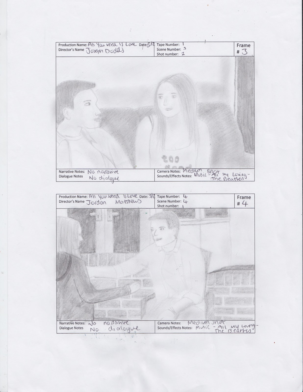
Images are in incorrect order but the frame number is correct.

We created our storyboards using storyboard templates. Our storyboards featured many pieces of information. Firstly, each frame features the production's name which is All You Need Is Love. We included the date that the shot was taken and which member of the group directed it. The tape number is the number of times we had taken that shot before creating a successful result. The scene number conveys the order the scenes run in. The shot number was the number of the shot in a particular scene when using different angles. In narrative notes we wrote whether or not a narrative non-diagetic voice is present and what is said by the narrator. Dialogue notes is for diagetic dialogue that comes from the characters. In camera notes, we wrote the camera angle and type of shot which was used. In sounds/effects notes we featured any other effects we may have used such as sound effects or editing in the shot.

Our whole group had an input when it came down to copying down information. This storyboard was mainly used for our editing because it told us which order to put our shots in as well as what music and voiceovers go over the top. The only frames we did not include in the storyboard were text and idents because we added this in during the editing process.

Monday, 16 April 2012

Editing

For our trailer, our whole group worked together when coming up with ideas and editing.
We edited our trailer using Final Cut Pro because this is what the college was able to provide us with and we were all familiar with it due to our AS work last year. It is also a useful program because it allowed us to use all the functions needed to create the trailer we wanted such as creating a split screen frame.
Firstly, we transferred all of our camera footage from our tape to the Apple Mac computers at college then imported this camera footage into Final Cut Pro. We then used the easy set up and use either the DV-NTSC Anamorphic format or the HDV-1080I50 format. We then set up a new sequence and saved our project ready for our editing.
In the editing process we all had a individual roles in the group to capitalise on the opportunities we were given with this project. Wesley would construct the brief frame of the trailer according to mine, Joseph's, Mollie's and Jordan's creative ideas and visions. Jordan and Joe would then go onto editing it further in terms of transitions and more precise shot orders and structures. The work would then be fed back to Mollie and I to further adjust until to our preference. This process was repeated until finally getting a product that we were all satisfied with. An issue occured right at the end of the process where the groups majority verdict decided to cut a few scenes from the end of the trailer, correspondent to our audience feedback whereas Wesley reintroduced the scenes at the last minute and consolidated the files without our consent, which in fairness was part of the original plan to include these shots.
So overall, my role in the editing was to give my feedback, ideas and criticisms to create a result that the whole group was satisfied with. My other more practical role was creating text using Motion 5 to put in our trailer and deciding what text would be appropriate to put in our trailer. At first we considered putting reviews from newspapers and magazines in order to entice the audience but we decided to include our text in our Beatles theme by using suitable Beatles lyrics.

Sunday, 15 April 2012

Finished trailer


Our trailer begins with two idents; one conveys that the trailer is suitable for all audiences and the other is the Working Title ident. These two idents were extracted off YouTube. The first song, 'All My Loving' by The Beatles begins when the Working Title ident appears. This music conveys the two main themes, love and The Beatles, before the clips from the film are even shown. Some white and red text appears (the white text contrasts agains the black background and the red symbolises romance) saying 'There's nothing you can do... That can't be done.'. These are lyrics taken from 'All You Need Is Love by The Beatles. This is relevant because it is a love song and these lyrics are taken from the song our film is named after. We made the word 'you' red because it catches the audience's attention and makes them think these lyrics are about them so it's personal. 'Done' is one of the key words in these lyrics and therefore this was coloured in red too. When this text appears, a voiceover is used saying 'Paul and Lucy were the hottest couple in town'. This gives the audience an insight into what the film is about and giving the audience some background knowledge. This background information is further revealed in the next 4 shots. The first shot is Paul and Lucy holding hands walking down a street looking happy. The next two shots are Paul and Lucy talking and still looking happy. The fourth shot shows Paul and Lucy hugging each other. These shots clearly convey that Paul and Lucy were previously a happy couple. We used longer fade in fade out transitions here to convey that these were past memories. Next, some text comes up saying 'A Beatles-inspired romantic comedy'. The words 'Beatles', 'romantic' and 'comedy' are in red because these are the key words in this text. 'Beatles' is a main theme and 'romantic' and 'comedy' are the genres.
The next shot shows Paul and his friend playing video games as boys do. His friend introduces Paul to the Beatles and 'She Loves You' by The Beatles begins to be played. The way Paul's friend sings along to The Beatles also adds a comedy element. This scene quickly jumps into a scene of Paul and his friend in Paul's room reading magazines about the Beatles, conveying Paul's new obsession. 'Help' by the Beatles is played which could give the audience the impression that Paul needs 'help'. 2 other clips are shown of Paul by himself drawing a picture of a member of the Beatles and wearing Beatles-style glasses, further demonstrating his obsession. More text appears in the style of the previous text saying 'There's nothing you can know... that isn't known.' which is more lyrics from the song 'All You Need Is Love'. The narrator says 'Now he's caught in a new love interest' and 'When I Saw Her Standing There' by The Beatles begins to play. This song reinforces that Paul and Stella are meeting for the first time. A panning upward shot of Stella is shown in a music store conveying that she is the new love interest. This shot also reveals the problem that occurs in the storyline destroying the equalibrium. A shot of Paul walking into the music store is shown followed by Paul and Stella meeting. A longer fade in fade out transition is used to separate the time and setting of that clip and the next clip. The following clip pans out from a poster of The Beatles to a shot of Paul reading a magazine about The Beatles further revealing his obsession. A phone call sound effect is then played and a split screen shot occurs. The split screen shows Lucy at her house asking Paul if he is still meeting her later then Paul appears in his room letting her down. Paul's shot disappears and the audience is left with Lucy's half of the shot and she is looking disappointed. The fade out technique used also adds to the sad mood this shot is expected to evoke. A shot of Paul and his friend in Paul's room again is shown next and Paul is getting advice from his friend. He is unsure of whether to be with Stella or Lucy and his friend gives him advice. A comedy element as well as a Beatles theme is used in this shot when Paul's friend says "Lucy loves you" then they both say "yeah..." "yeah..." "yeah..."- this is a pun on the song 'She Loves You" by The Beatles. 'All You Need Is Love' by the Beatles begins to play as that scene fades out and more lyrics appear. The trailer then jumps to a shot of Paul and Stella at Paul's house looking at a Beatles CD and Paul is clearly acting off with Stella. This shot then fades out to the film's title and Stella says 'maybe we shouldn't be together', conveying that Stella and Paul do not stay together and the original equalibrium between Paul and Lucy may occur again. An image of London in black and white is used as the background image because this is where our film would be set and the title, 'All You Need Is Love', is in black, white and red font. The black and white matches the background and the red adds to the comedy element of the film's genres. The narrator says 'Working Title presents All You Need Is Love', reminding audience about the production company of the film. 'Coming Soon' then flashes up at the end making the audience aware of when they will be able to see the film.

Here are some positive points I have identified in our trailer:
  • Our use of text with the lyrics suits each shot well.
  • The music we have used clearly reflects the themes of our film perfectly (love and The Beatles).
  • We have been able to experiment with many different types of shots creating alot of variation.
  • Our use of costume was good because we used colour symbolism to convey the character's personalities (e.g. Stella wears red and red symbolises love and danger).
  • We made the characters dress similarly to how teenagers in this era dress, clearly conveying the time period.
  • Our idents make our trailer look more professional and realistic.

Here are some of my own criticisms and factors I would of changed if given the opportunity to recreate this trailer:
  • I would of liked to create our own ident so we can learn more skills on Motion.
  • The majority of our dialogue has low quality sound due to our microphones. For example, background noises were often picked up. I would of liked to of used higher quality microphones to prevent this.
  • We often had to use voiceovers due to our low quality sound from each clip and sometimes the voiceover wasn't in sync with the characters' mouth movements. This could of been prevented if we had used higher quality microphones.
  • Our transition effectss are not always consistent. There is sometimes too much variation with transitions making it look less professional.
  • In a few of the shots we took we noticed errors. For example, Paul's poster of The Beatles appeared to not have straight alignment on the wall. If we had the opportunity it would of been convenient to refilm these.
  • Due to our lack of experience with lighting, this often failed us. For example, in the shots of Lucy and Paul talking on the sofa, Paul in the mirror and Paul and Stella on the sofa, the lighting looked dull and sometimes added a yellow tinge.
  • Some of our shots didn't come out clear. For example, the shot of Stella in the CD shop was particularly blurry. We would of liked to refilm these shots too.
  • The sound effect of the phone ringing was louder than the rest of the trailer. Changing this would of made it sound more realistic.
  • Sometimes the dialogue isn't clearly heard over the music due to our microphone problems. For example, it is difficult to hear Paul's response to his friend playing 'She Loves You' by The Beatles to him because the music is so loud.
  • The text saying 'Coming Soon' at the end of the trailer flashes up very quickly and suddenly. The length of time that this text is shown for should of been extended to make it more clear to the audience.

Finished film poster

After refreshing my Photoshop skills whilst making my magazine cover, I found making my film poster easier to do and I didn't need to do any drafts due to my plan I had previously made. This is the finished result:


I started with creating a new Photoshop file with size A4 international paper. I then created a radial gradient with the shades #db4f50 and #ff5a5a using the gradient tool. I downloaded a font in the style of the Beatles logo online from www.fontspace.com. The font I used is called BOOTLE. I created a new layer on Photoshop and used the text tool to write 'All You Need Is' in black letters (#000000) and size 70pt font. I made the first letters of each word larger (100pt) to make the texts appear to look more like the Beatles logo. I then added a drop shadow and an inner shadow to make the text look more dramatic. I used black text because it contrasts against the background colour of the poster and matches Paul's suit.
I then created another layer and used the text tool to write 'Love' in the same font except I made the text larger ('L' was written in 200pt and the rest of the word was written in 150pt) and I used a red colour (#dd0303). I used the colour red as it symbolises romance, conveying the romance genre clearly. I also used an inner shadow to make sure the colours of the text and the background contrast as well as adding dramatic effect. I gave these two layers of text centre alignment so the would stand out and I placed the text at the top of the poster so it is still eye-catching and it leaves plenty of space for my main photo.
I then created another layer and wrote the slogan of our film, 'There's nothing you can do that can't be done' in size 24pt font with the first letters of each word in 36pt. Similarly to the other text, I used the font BOOTLE. I used a light pink colour (#febaba) as pink is another colour associated with romance. I used a drop shadow and inner shadow so that the text did not blend in with the background and the slight outline created a boundary between the colours. I placed this text under the title of the film as a film poster convention.
I created another new layer and then went on www.dafont.com to download a font which was similar to the conventional font which can be found at the bottom of most film posters. I downloaded a font called SF Movie Poster which suited this style of text perfectly. I used a black colour (#000000) and used size 30pt. I wrote 'A WORKING TITLE PRODUCTION STARRING JOSH FARRANT MELANIE WRIGHT MOLLIE LAMBERT'; I did not use commas or the word and (or &) because according to my research,  most film posters do this. When I tried to write more text beneath this in the same layer, it created a large gap between the two lines which I was not satisfied with so instead, I created another new layer. I used the same style of font and wrote 'DIRECTED BY JOSEPH DODDS EDITED BY WESLEY GYECHIE JORDAN MATTHEWS'. I placed both these text layers at the bottom of my poster, like most conventional film posters, and gave them centre alignment. I also gave the text a drop shadow to make it look less plain and more 3D. I then aligned the one of the lines slightly to the left in order to make room for some icons later on.
I then opened up the image I intended to use in a separate Photoshop tab. I created a new photo filter adjustment layer and chose the cooling filter (80) to remove the yellow undertones. I used the quick selection tool, lasso tool and magnetic lasso tools to cut me, Josh and Mollie out of the image. I then used the refine edge tool to make the edges of the image look smoother. I then used the blur tool, clone stamp tool and smudge tool to improve our looks physically. I copied and pasted this selection onto my poster and placed us in the centre of the poster. I placed us there because when an audience sees this poster, the first thing they see will be Stella, Paul and Lucy and this image gives the audience their first impressions of the film. In order to blend the image into the poster, making the image less sharp, I added a layer mask to my photo's layer and created a transparent gradient. I did this by applying a black/white gradient to the image. I then added a drop shadow and inner shadow effect to this image to make the characters look more 3D and to blend the image in more with the background instead of creating a sharp contrast.
Once I had completed these steps, I added some icons. I found a BBFC certificate 15 image and made it smaller using the free transform tool. I then found a Facebook icon on Google Images and used the free transform tool again to make it smaller. I removed any unwanted background colour from these icons using the same selection tools I used before with my photo. Next to the Facebook icon, I used the text tool to write 'All You Need Is Love' which indicates that that is the name of the fan page for the film on Facebook. I wrote this text in bold Calibri font and size 8pt using the colour #040404. I used this font because it is clear, I chose this font size so it is a similar size to the Facebook icon and I chose this colour because it matches the rest of the black text. I also added an inner shadow effect to this text to make it similar to the rest of the text again.

If I made more changes to my film magazine I would of taken another photo which I could use as the background of my poster instead of a gradient. For example, I could of used a park which is where some of the film is set. I also would of given myself more time to work on this poster to experiment with new Photoshop tools as I used similar tools in my poster and my film magazine.
Thursday, 29 March 2012

Finished magazine cover

Before I started creating my magazine cover, I needed to edit the photo I was planning to use on the cover. I edited the lighting of my photo by creating a new photo filter adjustment layer and choosing the cooling filter (80). This removed the yellowy tinge that my photo previously had.


I then created another Photoshop file in the size International Paper A4 then created a radial gradient in two shades of grey. Using the quick selection tool I cut me and Mollie out of the original photo and used the refine edge tools (mostly refine radius tool) to make some of the lines look less rough and to remove some of the previous background colour from the gaps in Mollie's hair. I then copied and pasted the cut out on to my new image and added a slight drop shadow and inner shadow to make the image stand out more.


I then used the auto tone and auto colour tones to make me and Mollie's skin tones look more natural. Then using tools such as the clone stamp tool, the blur tool and the smudge tool I removed me and Mollie's imperfections. I rotated the image 90 degrees clockwise and wrote some text saying 'TAKE' in Frank Gothic Medium, size 72pt in the colour #ff96ac. Then I rotated the image back 90 degrees anticlockwise and used the text tool again, this time writing 'ONE' in Lucida Sans, size 200pt and in the colour #ff6497. Above this text I wrote "THE ONLY FILM MAGAZINE FOR FEMALES" in Lucida Sans, size 24pt and in the colour #ffffff. I added an outer and inner glow to all the text to make it stand out and it also gives imagery of bright lights which are used when creating films. The phrase 'the only film magazine for females' would encourage female readers because the word 'only' makes the magazine look exclusive and desirable. It also specifies the target audience of the magazine. I used pinks and whites for the text because this is also feminine, conveying the target audience clearly whilst appealing to them too. I then created a separate layer and cut out mine and Mollie's heads, then cut and pasted them into the new layer. I placed this layer in front of the masthead of the magazine so that mine and Mollie's heads were visible. This is a technique frequently used on magazine covers as the models on the front are important when encouraging people to buy the magazine.


I then proceeded to add a barcode with the magazine's website to the bottom right-hand corner of my magazine cover as a typical magazine convention. Then I added lots of text related to the main photo and some smaller text about other films released that month. Most of the text is pink and orange because this is a feminine colour scheme and the colours go well together whilst contrasting effectively against the images and colours I've previously used. I used black text for 'The Woman In Black' to make it match the film's title and to make it eye-catching. I used a variety of inner and outer glows and inner and drop shadows as well as many different fonts to make the magazine cover exciting and eye-catching. Other magazine conventions I added to my front cover were the price and the date that this issue is released and they are featured below the masthead so that they are easy to find. 


I think the strengths of my magazine cover are that it features all the necessary conventions of magazines such as a masthead, a slogan, models on the cover, a barcode, a price, a website and the date of the issue's release. I also used conventions of film magazines such as only using a singular image and featuring lots of text. All the articles advertised on my front cover are for films too. My idea for my film magazine is also very individual and it would be an independent magazine due to its female focus.
The weaknesses of my magazine cover are that it does not appeal to a large audience. As my target audience is so specific, it would not gain as many readers as other film magazines such as Total Film and Empire. The colour scheme I have used could also be seen as very stereotypical due to the large amount of pink and it is important to consider the types of women who may read this magazine and this colour scheme may not appeal to all of them. However, as this issue's main focus is on a romantic comedy this is acceptable. Pink is often a colour used in many young girls' magazines so my colour scheme can also be seen as a weakness because my magazine is not aimed at young girls, it is likely to be read by females aged 18- 31. 
Changes I could of possibly made to my magazine would be featuring the institution that owns my magazine to raise awareness of it. I could pay more attention to the costumes of me and Mollie on the cover; I could convey us as being more like our characters instead of ourselves personally like other film magazines. The costumes me and Mollie wore made it difficult for me to come up with an appropriate colour scheme due to the contrast in our outfits; it was hard to find colours that wouldn't match or clash badly with Mollie's red shirt.

This is my finished product:

Tuesday, 20 March 2012

Magazine cover drafts

I've had a few attempts at my magazine cover and frequently changed my mind about color schemes.


 The first cover is the idea I am going to continue working on. It still has feminine themes such as females on the cover and pink text but the grey background neutralizes the cover, making it less overwhelming unlike the other two. I felt that once I'd started working on the second and third covers, it reminded me more of young girls magazines and they did not look like film magazines at all. As film magazines tend to use quite dark colors, the grey suits the audience and form of my magazine perfectly. As I continue to work on my magazine cover, I just need to add text, a bar code, a price and other typical magazine conventions. I may also do some more editing to the photo of me and mollie making it blend in more with the magazine cover.

Friday, 16 March 2012

Risk assessment sheets


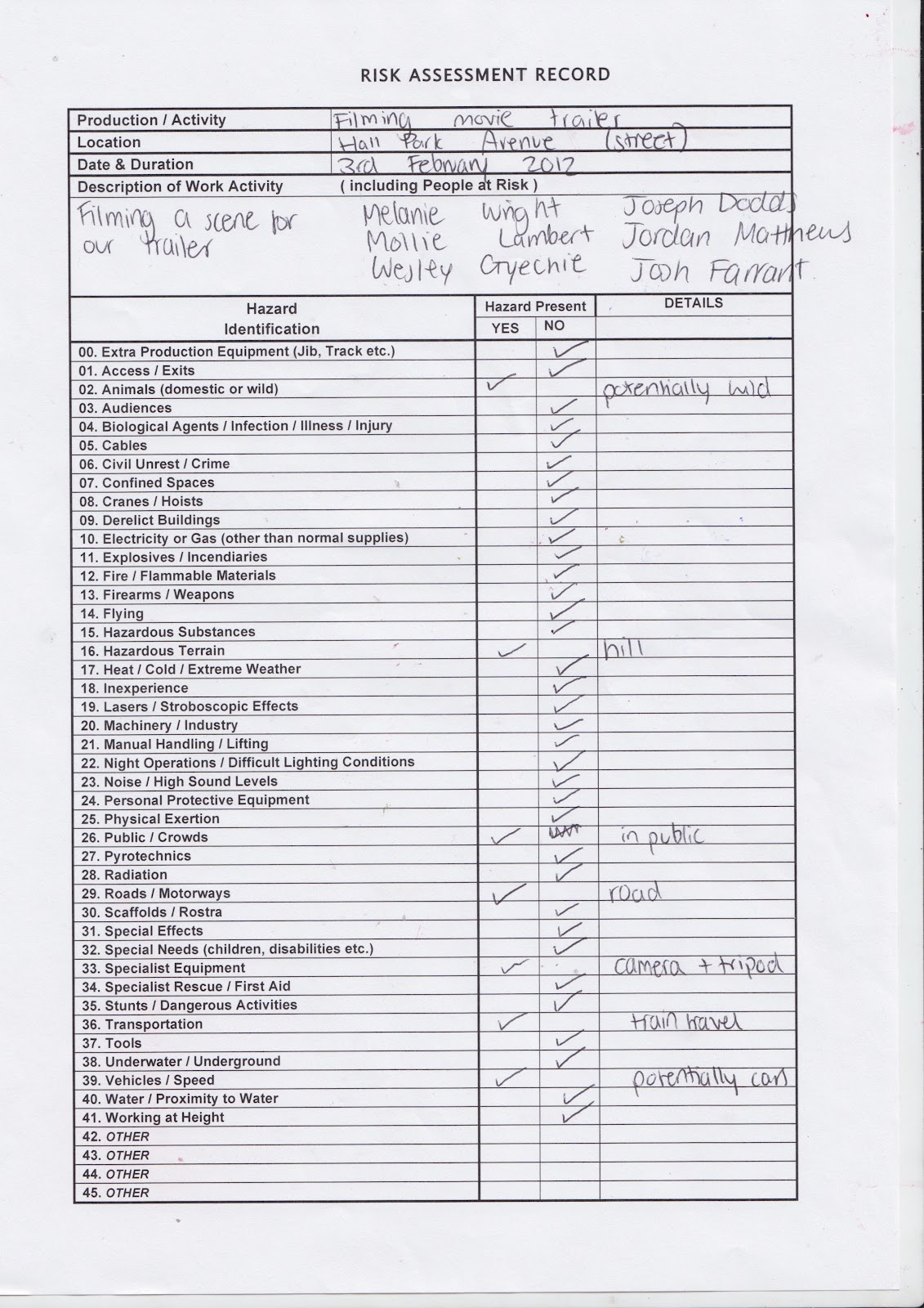
We used these risk assessment sheets provided by our college to consider risks and hazards we may come across when filming. We used one risk assessment sheet for each location. There were considerably more risks when we filmed on the street because we were filming in public and therefore we can not control hazards easily. Some hazards could be controlled at Joe's house such as cables but we had to be cautious about some hazards such how we were inexperienced with lighting. Overall, when we filmed no one was ever put at risk and we experienced no problems.