In my evaluation the only resource I had was my laptop because all of my evaluation was completed at home. I tried to include as many media products as I could; written blogs, photos taken by us, images found online, charts, personal webcam videos and videos found on YouTube.
For my first evaluation question, 'In what ways does your media product use, develop or challenge forms and conventions of real media products', I divided it up into three separate blogs focusing on different parts of the question. One focused on the use of forms and conventions, one focused on development and the other focused on challenging. In my blog about using forms and conventions I filmed myself using the built-in webcam on my Toshiba laptop then edited it using Windows Live Movie Maker. The camera and the microphone on my webcam are not very high quality so if I wanted to create a higher quality video I could of used my digital camera or even a handycam or XL2 like we did for filming our trailer. Making these videos and editing them was very time consuming so I decided to just create two of them. From making these videos, I refreshed my skills on Windows Live Movie Maker. As these video blogs were only home-made, I did not think it was necessary to edit them on Final Cut Pro because using such a professional programme would be even more time consuming. I used a video I had found on YouTube of The Beatles performing 'All You Need Is Love'. Using my own personal video blogs showed some of my editing skills when using basic editing software and the YouTube videos conveyed my knowledge of using HTML because I was able to embed these YouTube videos onto my blog. Most of the images I had used, apart from my screenshots, were found on Google Images and these convey my knowledge of using search engines. These images were relevant to what I was writing about. I created my own screenshots using the print screen button on my laptop and circled the adverts I found on the film magazine websites using Paint as it is quick and simple to use.
For my second blog I focused on the development of forms and conventions that I had used in my media products. I used an image of The Beatles which I found on Google Images to convey the theme of our film and to show how The Beatles used to dress. I also used a photo I had taken myself of me, Josh and Mollie which conveys what me, Mollie and Josh wore on my poster/magazine cover and in our trailer. The other two images I used were magazine covers which I had chosen from Google Images. I used these two images to show which conventions from each genre of magazine I had selected to include in my own magazine cover. I also embedded our trailer into this blog to add some media variety.
For my third blog addressing how I had challenged forms and conventions of media products, all the images I used (apart from the photo of me and Mollie which I had directed myself) were taken from Google Images. The images I used were all relevant to what I was writing about and it gives further imagery and understanding to the reader. I used the image of me and Mollie which belonged to me so that one of my own images was used creating some originality.
For my next evaluation question, 'How effective is the combination of your main product and ancilliary texts', I only used two images. I used my film poster so that when I was talking about the creation process it could be referred back to visually. I also used an image of a heart which I had discovered on Google Images. I cropped this heart slightly on Paint as it has a large white space around it which I wanted to remove to make it fit in better with my blog.
For my evaluation question about audience feedback, "what have you learned from your audience feedback?", I conducted my own research by creating a questionnaire on Microsoft Word, printing it out using a printer, then photocopying it using a photocopier. When I received my results, I created charts using Microsoft Excel. I have experienced using Microsoft Excel before but I had not used it for years so I had to look up some tutorials on Google in order to refresh my memory. My knowledge quickly came back and I was able to make many charts which made the results from my questionnaires clear and easier to understand.
In this final evaluation question, "How did you use new media technologies in the construction and research, planning and evaluation stages?" I only used images which I had found on Google Images as I did not feel that any other media technologies were necessary. However, I did separate this question into individual blogs again to make them look aesthetically pleasing and organised.
The main technology I used throughout my whole blog was this website, www.blogger.com. Since using Blogger again, I have adjusted to the new interface and also learned new techniques such as how to insert HTML. I used Blogger for my media coursework last year so I was already familiar with most of the tools and I was able to refresh my memory and regain my skills quickly. Blogger is convenient because you can save posts into drafts and finish them when you have the time instead of having to publish them straight away. You can also add any HTML, images, videos and text. It is easy to personalise and with the help of blogger I have managed to make my blog look exactly how I would like it.
Monday, 23 April 2012
Evaluation- How did you use new media technologies in the research and planning stages?

When I was planning my project I didn't use any particularly new media technologies when conducting my research. First of all I used Google Chrome and Internet Explorer on Microsoft Windows computers or Safari on Apple MAC computers to conduct the majority of my research. If I needed a small piece of information quickly I also used the internet browser on my Blackberry Torch mobile phone. I used the internet to get access to search engines like Google so I could research information. I often used YouTube to look at film trailers and Photoshop tutorials. I also looked at many other different websites which had Photoshop tutorials on them if I wanted to learn how to do a specific task (for example, I had to use Google to find a tutorial on how to get rid of the golden tinge in the photos we took for our posters/magazine covers which is how I discovered how to use adjustment layers). I also looked out for cinema/DVD film trailers when I was watching television or DVDs so that I could analyse conventions of different trailers more to deepen my understanding of what makes a professional, successful film trailer. I also used Microsoft Word on many occasions to write up my research then I printed it off using my small printer at home or the more professional and complex printers available at my college so that I could transport my research around with me and refer to it when it is needed.

When planning and doing our written pre-production I did experience using some new media technologies. The three technologies I experienced using for the first time were scanners, photocopiers and the Apple programme Celtx. I used the scanners to upload our storyboards and our risk assessment sheets from a sheet of paper to a file on my college user space and my personal USB pen drive. I used a photocopier to photocopy our storyboard templates and to photocopy our call sheets (so we had enough call sheets to give out during our filming). These two technologies were very simple to use. Celtx was a bit more complex to use as none of us had used it before but we received tutorials from our teacher and then we used this to create our scripts. Celtx allowed our scripts to look more professional and we were able to make our scripts clear ready for when we filmed.
Other technologies I used which I had already had previous experience with were Google Maps and the BBC weather websites. I used Google maps to get directions from the closest train station to our filming location. This was useful because we could print this information straight from the website and give it out to our group and our other actor with the call sheets. The information was also very clear stating how far away it is, how long it takes to walk and exactly what directions to take. We used BBC weather to check on the weather conditions for our filming as the weather affects how hazardous our environment is, how easy it is to get to filming locations and how our effective our lighting would be. Although British weather and weather websites can be unreliable, this still gave us an idea of whether the weather would be appropriate for whatever we were filming that day.
Evaluation- How did you use new media technologies in the construction stages?
Filming


The technology we used for our editing was a microphone and Apple MAC computers with programmes on it such as Motion and Final Cut Pro. As I used MACs last year for my media, I was already familiar with them this year and had no difficulty using them. They were also easily accessible at my college.

When filming our trailer, the only technology we used was a tape, cameras and lighting. As we had all experienced using cameras and tape last year, we had no difficulty refreshing our memories when it came to beginning our filming. The tape was simple to use because it kept all of our footage in one place and it was simple to transport and to insert into our camera. We used two different cameras; a handycam and an XL2. We filmed a lot of our shots using the XL2 but it was sometimes difficult to use especially for people such as myself who were less experienced than others at using cameras. The handycam was much simpler to use although the quality of the video was less high quality. If we were given the opportunity to recreate our trailer then our group could all focus on learning how to use more professional cameras such as the XL2 so that we could create more high quality shots with less difficulty.
Taken from my previous blog: filming evaluation:
"On our first filming day, our camera ran out of battery so we couldn't do many shots. As our equipment was borrowed from our college, only they could charge it so we had to return it. On future filming days we always made sure we had a fully-charged camera. On some filming days, we'd take shots then watch them over and realise that we needed improvement on factors such as lighting, sound and camera focus. For example, in some of our shots the lighting was too dull and in others it was too bright and there were clear shadows behind the characters. Many of our shots had terrible sound but we can re-record it at college using microphones. As one time we were given a scratched camera, many of our shots came out blurry and therefore we had to re-film."
None of my filming group had ever used lighting before so using lighting was a new experience for us. We found it quite simple to use when we were setting it up and it was useful when we were in rooms with less efficient lighting or when the weather made our indoor lighting look dull. However, we did also face problems with our lighting. Sometimes it would be too bright and it would create shadows. For example, a shadow can be seen in these two scenes due to the lighting being too overpowering in the shot:


These mistakes are not necessarily damaging to our trailer though. The shadows in the first shot above could give an intimate atmosphere, like this moment is taking place in the evening. In the second shot, the shadows are not particularly noticeable due to the camera being more distant from the characters than the shot above it.
Editing our trailer


The technology we used for our editing was a microphone and Apple MAC computers with programmes on it such as Motion and Final Cut Pro. As I used MACs last year for my media, I was already familiar with them this year and had no difficulty using them. They were also easily accessible at my college.
Taken from my previous blog: editing
"We edited our trailer using Final Cut Pro because this is what the college was able to provide us with and we were all familiar with it due to our AS work last year. It is also a useful program because it allowed us to use all the functions needed to create the trailer we wanted such as creating a split screen frame.
Firstly, we transferred all of our camera footage from our tape to the Apple Mac computers at college then imported this camera footage into Final Cut Pro. We then used the easy set up and use either the DV-NTSC Anamorphic format or the HDV-1080I50 format. We then set up a new sequence and saved our project ready for our editing.
In the editing process we all had a individual roles in the group to capitalise on the opportunities we were given with this project. Wesley would construct the brief frame of the trailer according to mine, Joseph's, Mollie's and Jordan's creative ideas and visions. Jordan and Joe would then go onto editing it further in terms of transitions and more precise shot orders and structures. The work would then be fed back to Mollie and I to further adjust until to our preference. This process was repeated until finally getting a product that we were all satisfied with. An issue occured right at the end of the process where the groups majority verdict decided to cut a few scenes from the end of the trailer, correspondent to our audience feedback whereas Wesley reintroduced the scenes at the last minute and consolidated the files without our consent, which in fairness was part of the original plan to include these shots."
Due to my previous experience in using Final Cut Pro and Motion, I had no difficulty when it came to refreshing my skills. Our group learned new skills such as how to create voiceovers using microphones. The microphones we used were not very high quality so if we were to recreate our trailer it would be convenient to use more professional microphones to create better results. Other new skills we learned included how to create a split-screen shot and how to use transitions because I had used neither of these techniques before. Due to our previous knowledge, online research and our teachers' assitance our editing process went reasonably well. Due to the short period of time we had and due to having a large group, our final trailer was not as good as we had hoped. The short period of time made it difficult to access the most professional microphone for our voiceover because we would not have the time to learn how to use it. We also did not have the time to fix some mistakes (for example, the sound quality and the flow of our transitions from frame to frame) and perfect our trailer. I found Motion simple to use as I only used it to create text which is something I had experienced doing before. I would of liked to have more of an input when it came to editing our trailer on Final Cut Pro but due to having a large group this was sometimes difficult. However, my opinion was always heard and I did get to use my skills in Motion and Final Cut Pro on a few occasions.
Creating my film poster and magazine cover

For my magazine cover and my film poster, the only technologies I used were a Canon EOS 450D and Photoshop CS5. Most of us, including me, had previous experience in using DSLR cameras so using this one was quite easy for us. We used or college's professional photography studio so we had all the resources we needed to take high quality photos. The only problems we had when using the photography studio was that our lighting gave some of our photos a golden tinge. However, this was something we could easily edit out using Photoshop.
I have also had years of experience in using Photoshop. However, I learned new skills this year such as how to use the clone stamp tool, how to create transparent gradients, how to refine the edges using the selection tools, how to add shadow and glow effects to text and how to use adjustment layers. All these skills were useful in creating my magazine cover and my film poster because I was able to make a more professional-looking product than I could previously. Photoshop was easily accessible because I had it at home as well as being able to use it at college so when I wasn't at college I could practise at home if I needed to.
Evaluation- What have you learned from your audience feedback?
After creating my media products, I decided to get some audience feedback to find out whether my target audience would be interested in my products (and if not, what I should change). This feedback will help me realise what to change in order for my products to be successful if I was using them in reality. This feedback also deepens my understanding of what appeals to this target audience generally.
I created an independent questionnaire using Microsoft Word made up of 20 questions and gave it out to 20 people. If I wanted to collect more valid and reliable data, I would have to use a bigger sample. I made my questionnaires anonymous so that people were less likely to be biased, making my data more valid. However, because I chose my friends to fill this in there may be a slight bias of kindness so they would not be as critical as strangers would be. If I was giving this questionnaire to a bigger sample I would also choose strangers to prevent this bias. The questionnaires also had set answers instead of them being open which means I could turn this data into charts quickly. Charts make the data clearer and makes the data quantitative. If I was going to collect more accurate results, I would make the questions open so the audience can write their own personal answers. However, this would be time consuming because I would have to read through all the qualitative data in order to gain an understanding of my audience. I also would not be able to turn this data into charts, making it harder to read. Qualitative data is also less reliable because you cannot repeat the experiment whereas if I lost my research, I could simply give out my closed question questionnaires and receive similar results.
Here is a copy of my questionnaire converted to a .PDF file and uploaded onto scribd.com:
Media Questionnaire
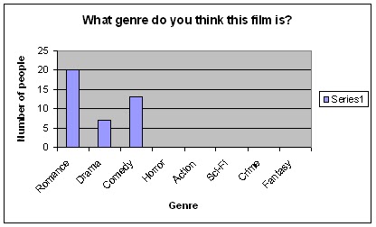
I asked the name and the gender of the audience so that I knew what target audience they were. I gave out my questionnaire to people who were interested in romantic comedies so that their answers would be useful to me as it is them that I'm trying to make my film appeal to. However, if this wasn't the case then my questionnaire will tell me what genres of film they usually watch. Everyone who did my questionnaire circled romance or comedy so this was convenient. Everyone I asked was also aged 15- 18 as this age group is easy to access at college but if I wanted more valid results I could of asked a larger sample of different ages. I showed the participants my film trailer, my poster and my film magazine cover before allowing them to fill the questionnaire in.
Trailer questions


Most of the audience said they would pay to see this film. This is a positive response because this means the film would attract a large audience and therefore be successful. This also means that the trailer made most of the audience want to see the film and that it's purpose has succeeded.

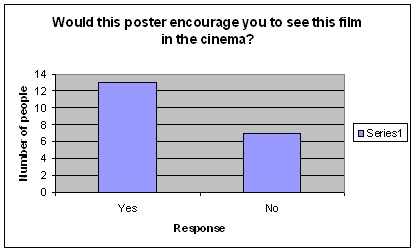
An equal amount of people voted yes and no. It is good that people are already considering purchasing this film before they have viewed it. When people say no I have considered that they may have to see the film first before making their decision so overall this feedback is positive.

Most people said yes to this question meaning that they think their friends will like this too, expanding our audience. However, the large amount of no's makes me reconsider whether this response was good or not considering all the participants liked romantic comedies.

This is one of the most positive responses I have had. The music must be well-suited for our film so no changed would need to be made.


These responses surprised me because I was unhappy with how our filming and editing turned out. This feedback is good but I still think changes should of been made. I was unhappy with the filming because some of the shots did not come out the way we wanted them and I was unhappy with the editing because of the limited amount of time we had to edit. This limited time caused personal conflicts due to contrasting ideas and this slowed us down.

This response was very mixed. An equal amount of people gave it over and under 3 or 4 stars which is strange considering this does not match the previous data. However, the half that enjoyed the trailer make our film successful.
Overall from the audience feedback for our trailer the views are very mixed. They are mostly positive but I feel that if we were able to make the changes to our filming and our editing without the limited timing we would of got more positive reviews.
Film poster questions
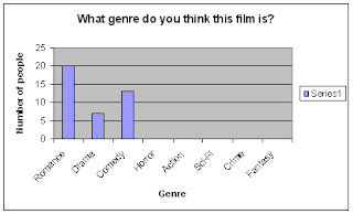
Once again, every participant recognised that my film poster was for a film in the romance genre. However, they did not recognise that it had elements of comedy and 7 participants thought it was a drama. I should have made the comedy genre more clear on my film poster if I was able to redraft it.

The 15- 18 age group was the most dominant again which is good. All the answers selected fitted into our target audience meaning that my film poster would be successful in this aspect. I was surprised that more people selected 22- 27 than 19- 21 as my film is aimed at a younger audience than this but as The Beatles is an old band this is likely to be the reason why considering one of our film's main themes is The Beatles.
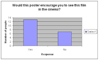
The majority of the people who took my questionnaire answered yes to this question which is a positive response. However, 7 people said no which is just over 1/4 of the applicants. I could of made my film more enticing by adding a newspaper/magazine review or using more exciting images and maybe a different background image.
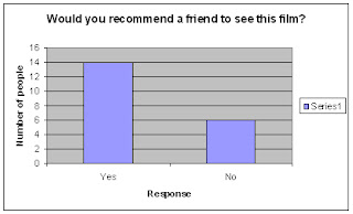
This question had a more positive response than the one above. This could possibly be because their friends may be more interested in The Beatles or romantic comedies than themselves. Just over 1/4 of the applicants responded saying no again though which means I would consider the same changes as said above.

This question received a more positive response than I expected. I wasn't keen on my poster because I couldn't get a suitable background image which I feel made a huge difference to how professional my poster looked. However, this positive response shows that my film poster still appeals to this audience.

This is another one of the best responses I received. Every applicant thought my colour scheme was appropriate which I expected because I knew exactly what colours to use for the romance genre. If I was to redraft my film poster I would not change any of the colours I have selected.

My poster mostly received three stars which I would class as an average score. A few people thought it was four stars or above too which is positive. Once again I feel that the background image was the main cause of this because it made the poster lack professionalism. However, I did receive mostly positive responses which is great.
Magazine cover

This response is great considering the target audience for my magazine is females. No one said it was for males. One person said this magazine was for both which I do not see as a negative response because it means I'd have a larger readership according to them. This data shows that I have used female magazine conventions successfully.

I asked the participants to look at the advertisement of my film on the cover and guess the target age group of the film. This obtained similar results to what I got for the film poster which was what I was hoping for.

3/4 of the participants said they would purchase this magazine which was a great response. When looking at the 1/4 who said they wouldn't, it is important to consider whether this audience usually purchases film magazines. I could attracted a larger readership by adding enticements to the front cover or featuring more images of people engaging eye contact with the camera, catching the audience's attention. However, as film magazines are more popular with men, a female film magazine is a new idea which may need adjusting to.

This response is another one of the best responses I obtained. All but two of the participants said they would see this film after seeing this film on the magazine cover. This means I have advertised the film successfully on the front cover attracting a readership and an audience for the film.

This question received a fantastic response. Every participant agreed that this magazine is appropriate for girls, meaning that I have achieved female magazine conventions successfully.

This question was one of the least successful. The majority of participants said they would pay under £3 to purchase this magazine. My magazine would cost £3.95 and only one person said they would pay this amount. If I were to redraft my magazine cover it is likely that I would have to reduce its price to satisfy the target audience.
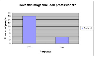
I received an overall positive outcome for this question. The majority of participants thought my magazine cover looked professional. I tried hard to make my magazine look as professional as I could with the skills I knew and had learned so if I wanted it to look more professional I could of taken better photos or used a background image more like film magazines like Empire and Total Film. It is likely I would of done this anyway if I were to redraft.

My magazine cover obtained the highest star rating out of all my individual pieces as the majority of participants gave it five stars. Therefore if I were to redraft all my practical pieces I would focus more on the other two pieces of work than my magazine cover. I expected this result because my magazine cover is the piece of work I feel most confident about when considering how professional it looks.
All the results from my questionnaire convey that my work is to a good enough standard to appeal to the majority of the participants. This feedback has made me realise what changes I may of had to make if I were to do further work on my media. Overall I am satisfied with the feedback I received and this has been convenient because if I were to create this media in a more professional aspect then I would have a better idea of what my target audience want.
I created an independent questionnaire using Microsoft Word made up of 20 questions and gave it out to 20 people. If I wanted to collect more valid and reliable data, I would have to use a bigger sample. I made my questionnaires anonymous so that people were less likely to be biased, making my data more valid. However, because I chose my friends to fill this in there may be a slight bias of kindness so they would not be as critical as strangers would be. If I was giving this questionnaire to a bigger sample I would also choose strangers to prevent this bias. The questionnaires also had set answers instead of them being open which means I could turn this data into charts quickly. Charts make the data clearer and makes the data quantitative. If I was going to collect more accurate results, I would make the questions open so the audience can write their own personal answers. However, this would be time consuming because I would have to read through all the qualitative data in order to gain an understanding of my audience. I also would not be able to turn this data into charts, making it harder to read. Qualitative data is also less reliable because you cannot repeat the experiment whereas if I lost my research, I could simply give out my closed question questionnaires and receive similar results.
Here is a copy of my questionnaire converted to a .PDF file and uploaded onto scribd.com:
Media Questionnaire
I asked the name and the gender of the audience so that I knew what target audience they were. I gave out my questionnaire to people who were interested in romantic comedies so that their answers would be useful to me as it is them that I'm trying to make my film appeal to. However, if this wasn't the case then my questionnaire will tell me what genres of film they usually watch. Everyone who did my questionnaire circled romance or comedy so this was convenient. Everyone I asked was also aged 15- 18 as this age group is easy to access at college but if I wanted more valid results I could of asked a larger sample of different ages. I showed the participants my film trailer, my poster and my film magazine cover before allowing them to fill the questionnaire in.
Trailer questions

Everyone who filled in my questionnaire knew that my film was partially the romance genre so we must of made these conventions clear. Not everyone thought this was comedy so it is likely we should of included more comedy conventions. When we were creating our film we were considering making it part of the drama genre too but this idea never followed through, however some of the audience who filled in this questionnaire thought it was which is interesting. If we were to add our film to the drama genre this could go unnoticed.

Most of the audience thought the target audience is 15- 18 which is good because 15 is our film's BBFC certificate. The age groups chosen also fitted our actual target audience which is also good. This means our film suits our target audience.

Most of the audience said they would pay to see this film. This is a positive response because this means the film would attract a large audience and therefore be successful. This also means that the trailer made most of the audience want to see the film and that it's purpose has succeeded.

An equal amount of people voted yes and no. It is good that people are already considering purchasing this film before they have viewed it. When people say no I have considered that they may have to see the film first before making their decision so overall this feedback is positive.

Most people said yes to this question meaning that they think their friends will like this too, expanding our audience. However, the large amount of no's makes me reconsider whether this response was good or not considering all the participants liked romantic comedies.

This is one of the most positive responses I have had. The music must be well-suited for our film so no changed would need to be made.


These responses surprised me because I was unhappy with how our filming and editing turned out. This feedback is good but I still think changes should of been made. I was unhappy with the filming because some of the shots did not come out the way we wanted them and I was unhappy with the editing because of the limited amount of time we had to edit. This limited time caused personal conflicts due to contrasting ideas and this slowed us down.

This response was very mixed. An equal amount of people gave it over and under 3 or 4 stars which is strange considering this does not match the previous data. However, the half that enjoyed the trailer make our film successful.
Overall from the audience feedback for our trailer the views are very mixed. They are mostly positive but I feel that if we were able to make the changes to our filming and our editing without the limited timing we would of got more positive reviews.
Film poster questions
Once again, every participant recognised that my film poster was for a film in the romance genre. However, they did not recognise that it had elements of comedy and 7 participants thought it was a drama. I should have made the comedy genre more clear on my film poster if I was able to redraft it.

The 15- 18 age group was the most dominant again which is good. All the answers selected fitted into our target audience meaning that my film poster would be successful in this aspect. I was surprised that more people selected 22- 27 than 19- 21 as my film is aimed at a younger audience than this but as The Beatles is an old band this is likely to be the reason why considering one of our film's main themes is The Beatles.
The majority of the people who took my questionnaire answered yes to this question which is a positive response. However, 7 people said no which is just over 1/4 of the applicants. I could of made my film more enticing by adding a newspaper/magazine review or using more exciting images and maybe a different background image.

This question had a more positive response than the one above. This could possibly be because their friends may be more interested in The Beatles or romantic comedies than themselves. Just over 1/4 of the applicants responded saying no again though which means I would consider the same changes as said above.

This question received a more positive response than I expected. I wasn't keen on my poster because I couldn't get a suitable background image which I feel made a huge difference to how professional my poster looked. However, this positive response shows that my film poster still appeals to this audience.

This is another one of the best responses I received. Every applicant thought my colour scheme was appropriate which I expected because I knew exactly what colours to use for the romance genre. If I was to redraft my film poster I would not change any of the colours I have selected.

My poster mostly received three stars which I would class as an average score. A few people thought it was four stars or above too which is positive. Once again I feel that the background image was the main cause of this because it made the poster lack professionalism. However, I did receive mostly positive responses which is great.
Magazine cover

This response is great considering the target audience for my magazine is females. No one said it was for males. One person said this magazine was for both which I do not see as a negative response because it means I'd have a larger readership according to them. This data shows that I have used female magazine conventions successfully.

I asked the participants to look at the advertisement of my film on the cover and guess the target age group of the film. This obtained similar results to what I got for the film poster which was what I was hoping for.

3/4 of the participants said they would purchase this magazine which was a great response. When looking at the 1/4 who said they wouldn't, it is important to consider whether this audience usually purchases film magazines. I could attracted a larger readership by adding enticements to the front cover or featuring more images of people engaging eye contact with the camera, catching the audience's attention. However, as film magazines are more popular with men, a female film magazine is a new idea which may need adjusting to.

This response is another one of the best responses I obtained. All but two of the participants said they would see this film after seeing this film on the magazine cover. This means I have advertised the film successfully on the front cover attracting a readership and an audience for the film.

This question received a fantastic response. Every participant agreed that this magazine is appropriate for girls, meaning that I have achieved female magazine conventions successfully.

This question was one of the least successful. The majority of participants said they would pay under £3 to purchase this magazine. My magazine would cost £3.95 and only one person said they would pay this amount. If I were to redraft my magazine cover it is likely that I would have to reduce its price to satisfy the target audience.

I received an overall positive outcome for this question. The majority of participants thought my magazine cover looked professional. I tried hard to make my magazine look as professional as I could with the skills I knew and had learned so if I wanted it to look more professional I could of taken better photos or used a background image more like film magazines like Empire and Total Film. It is likely I would of done this anyway if I were to redraft.

My magazine cover obtained the highest star rating out of all my individual pieces as the majority of participants gave it five stars. Therefore if I were to redraft all my practical pieces I would focus more on the other two pieces of work than my magazine cover. I expected this result because my magazine cover is the piece of work I feel most confident about when considering how professional it looks.
All the results from my questionnaire convey that my work is to a good enough standard to appeal to the majority of the participants. This feedback has made me realise what changes I may of had to make if I were to do further work on my media. Overall I am satisfied with the feedback I received and this has been convenient because if I were to create this media in a more professional aspect then I would have a better idea of what my target audience want.
How effective is the combination of your main product and ancillary texts?
Trailer and magazine cover


Film magazines do film a lot of favours when written about in a positive way. If the readership of a film magazine reads a positive review on a film, this will encourage them to see the film over a film which was given a less positive review. If a film is the main feature of a front cover, it is likely to be a highly recommended film by that magazine and therefore this encourages the readership of the magazine and anyone who sees the magazine cover to see the film.
My magazine cover features All You Need Is Love as the main article. The photo of the two main actresses (me and Mollie) who play the two main female characters (Lucy and Stella) is featured on the cover. Females are featured on the cover because my magazine is aimed at females. The two actresses have positive body language towards each other which gives the audience a positive outlook on the characters. The way the actresses engage eye contact with the camera also engages anyone who sees the magazine making them more likely to buy the magazine and see the film. Having All You Need Is Love on the front cover of a magazine is great advertising for the film and it encourages a larger audience.
The front cover also gives an insight into the storyline. As the two people on the cover are two of the main characters in All You Need Is Love, this also gives the audience an insight into the film. The characters are unlikely to be on the cover if they do not have big roles in the film. As I have described above, this image makes the characters look cheerful and as happiness is contagious this would engage the audience far more than a magazine cover with the main characters looking unhappy.
By looking back at my audience feedback I can tell a lot already about the audience's opinion on the film through this feature on the magazine cover. The majority of participants thought that this magazine conveys that the film's target audience is aged 15- 18. This is good feedback considering our film's BBFC certificate is 15. The majority of applicants also said they would see this film after seeing this magazine cover. This is a fantastic response and this means we would receive a large audience if this magazine was published.
Trailer and poster
My film poster does my trailer many favours because it clearly conveys the key themes of our film; romance and The Beatles. This is done in many ways. The colour scheme of my film poster is red, black and pink. The red and pink are used to clearly convey the romance genre. The font I used, BOOTLE, allowed me to create text in the style of The Beatles logo allowing my text to suit the theme of The Beatles. The use of an image the protagonist (Paul) with his two romantic interests (Stella and Lucy) standing behind him conveys the romance genre too. The way Stella and Lucy are facing Paul and are both standing close to him conveys the closeness between the individual girls and Paul. The way Paul is dressed like a member of The Beatles further enforces the theme of The Beatles in our film.
The positioning of the characters gives the audience an insight into the characters' personalities. Stella looks unhappy but she is standing close to Paul. This conveys that she is not going to be one of the audience's favourite characters and perhaps she will be the antagonist. As Stella is wearing red, this has colour symbolism of danger as well as passion so this conveys that Stella is a bad person in this film but she will be romantically linked with Paul. Paul stands in the centre in front of Stella and Lucy conveying that he is the main character and the protagonist. He is dressed like a member of The Beatles which immediately conveys that he is a fan of The Beatles and this is a key part of our storyline. Lucy is smiling and she is standing close to Paul conveying that she plays a positive role in the film as well as being another one of Paul's romantic interests. The way Lucy smiles also conveys that it is likely that Paul should be with her as she looks like she has a more warm and friendly personality than Stella.
The slogan of our film is featured on our film poster as well as in our trailer. This slogan gives the audience an insight into the film when they see the poster, then they are reminded of this slogan in the trailer which reinforces them to see the film. This also brands the film because many well known brands have slogan. This causes our film to be more recognised and awareness is raised.
According to my audience feedback, the film poster suits the trailer effectively. By looking at the film poster, the participants all agreed that our film is in the romance genre. The majority of participants also thought that our film was featured in the comedy genre. This is fantastic considering the comedy elements of our film are not clearly conveyed on our poster. Once again from my audience feedback I learned that most of the participants thought that our film's target audience was aged 15-18 which is great. The majority of participants also said they would see this film in the cinema and recommend their friends to see our film which means we could expect a large audience if our film was distributed. Every participant said that the colour scheme of my poster was appropriate for a romantic comedy which is fantastic as this will attract an audience that like romantic comedies successfully.
Evaluation- in what ways does your media product challenge forms and conventions of real media products?
Trailer
 Our trailer challenges the forms and conventions of real film trailers due to our film appealing to two different audiences; young women and fans of the Beatles. Most romantic comedies tend to appeal to women which is why women are part of our target audience. This audience combined with The Beatles huge fanbase creates a massive potential audience for our film. Our trailer also does not use as many frames as some trailers do; this is mainly due to the amount of time we had to film and edit our trailer. From the research on romantic comedy trailers I have previously conducted, I learned that most romantic comedy trailers feature around 94- 120 shots whereas our trailer only features around 16. However, the shots we took for our trailer were longer than the shots in conventional romantic comedy trailers which allowed our trailer to still be a similar length. If we were given more time we could follow conventions and take more shots at more angles so that we could reach the same amount of frames which conventional romantic comedy trailers use.


.jpg)


Magazine cover

 Our trailer challenges the forms and conventions of real film trailers due to our film appealing to two different audiences; young women and fans of the Beatles. Most romantic comedies tend to appeal to women which is why women are part of our target audience. This audience combined with The Beatles huge fanbase creates a massive potential audience for our film. Our trailer also does not use as many frames as some trailers do; this is mainly due to the amount of time we had to film and edit our trailer. From the research on romantic comedy trailers I have previously conducted, I learned that most romantic comedy trailers feature around 94- 120 shots whereas our trailer only features around 16. However, the shots we took for our trailer were longer than the shots in conventional romantic comedy trailers which allowed our trailer to still be a similar length. If we were given more time we could follow conventions and take more shots at more angles so that we could reach the same amount of frames which conventional romantic comedy trailers use.
Poster

The only way my poster particularly challenges film poster conventions is by not featuring a release date. I did not feature a release date because it would not fit on the poster. If I were to recreate my poster I could alter the sizes of the layers on my poster to make room for a release date or perhaps experiment with a landscape poster. However, what I have done is not uncommon. There are many film posters which do not feature release dates but they would be unsuitable for cinema advertising as the audience would need to know the date of its release. Here are some posters which do not feature release dates:
.jpg)


Magazine cover

When I was creating my magazine cover, I didn't challenge any major conventions. However, I did challenge a few minor ones which can sometimes be found on magazine covers. Female magazines that focus mostly on gossip and film magazines always have a lot of text on the front cover. My magazine cover only features five main pieces of text which could be seen as too little. Female gossip magazines such as Heat tend feature many images whereas my magazine only features one. I did this to maintain the balance between the two genres whilst edging more towards film magazine conventions because film magazines feature very few images (mostly just one image).
Magazines such as heat also feature more contrast when it comes to colour schemes. For example, the image used above features red, black, pink, purple, yellow, white and black. None of these colours particularly match. My magazine cover follows a pastel colour scheme which doesn't stand out as much as heat does. However, this allows my magazine to maintain the sophistication of female magazines such as Glamour and Marie Clare and the simple colour schemes of film magazines like Empire.
Evaluation- in what ways does your media product develop forms and conventions of real media products?
Trailer
When I develop forms and conventions, I am updating or changing them slightly. For our trailer, we took the idea of a film inspired by The Beatles' music and updated it to a modern romantic comedy. Many promotional films about The Beatles have been made such as Hey Jude and A Day in the Life but these weren't recent.
 |
| How The Beatles used to dress. |
 |
| How the characters dressed on our film poster. |
Magazine cover


I developed a new genre of magazine by combining the conventions of a film magazine with a female magazine. The purpose of a film magazine is to give the audience information about upcoming films and the purpose of a female magazine is to give information relevant to females about conventional female interests such as fashion, men and dieting. Female magazines also have a huge focus on gossip. I combined these two genres by making my magazine focus on upcoming films and film information as well as the gossip on set about topics relevant to females. I used plenty of text on the cover and contrasted the colours of the text as this is a convention frequently used by both genres of magazine.I took background ideas from female magazines and Entertainment Weekly and came up with the idea of a gradient background although film magazines usually have a suitable background image. If I were to recreate my film magazine it is likely that I would experiment with a background image instead of a gradient to add more film magazine conventions. Film magazines tend to use quite male-centred film magazines with lots of dark colours so I appealed to my female readership by using lighter colours instead and more feminine colours like pink and pastels. The main story of my front cover focuses on my film, All You Need Is Love. However, instead of focusing on the main film making it focuses more on the individual actresses' success. If I were to make this more film focused, I could focus on the actresses' roles and the actual film more than the actresses personally. However, I have featured a few other pieces of text conveying information about simply films which secures my magazine in the film magazine genre.
Evaluation- In what ways does your product use forms and conventions of real media products?
Trailer
For our trailer we mostly used forms and conventions of real film trailers instead of developing or challenging them. Many film trailers use voiceovers to tell the audience information about the storyline or the film in general. We used our voiceover to give the audience insights into the storyline (for example, when the narrator says "Paul and Lucy were the hottest couple in town") and to convey information about our film (for example, when the narrator says "Working Title presents All You Need Is Love" it conveys the production company and the title of the film).
The shots we created clearly conveyed the romantic comedy genre. All films of the romance genre feature shots of happy couples and this is something we frequently did. For example, the shot of Paul and Lucy holding hands and walking down the street happily and the shot where Stella and Paul are sitting closely on the sofa together. We used shots that conveyed the comedy genre too; these had to be humorous. For example, we did this when Paul looks in the mirror wearing his Beatles glasses. We also used shots we had learned about last year such as point of view shots (when Paul looks in the mirror), medium close-ups (when the shot pans up and reveals Stella in the shop), long shots (when Paul and Lucy walk down the street holding hands) and medium shots (when Paul and Lucy are talking on the sofa). We took shots from different angles (for example, when Paul and Lucy are talking on the sofa) to convey both of the character's facial expressions so the audience gains a full understanding of the situation. This is a convention used most film trailers.
I have never seen a film trailer without music so using music was an obvious convention. We used music to convey what was happening in each shot. We play 'She Loves You' when Paul's friend plays this song to him creating diegetic sound. We play 'Help' when Paul is going crazy about the Beatles and this conveys that he needs 'help'. 'When I Saw Her Standing There' is played when Paul meets Stella which suits the idea of them meeting for the first time. Finally, 'All You Need Is Love' is played to convey how Paul only needs Lucy's love and this is more important than the Beatles to him. This song also plays when the title appears reinforcing its name.
Our trailer features two idents which are used at the beginning of the trailer. Our first ident is a green screen saying 'The following preview has been approved for all audiences'. This ident is shown in many trailers, usually trailers found online on websites like YouTube. It conveys that the trailer is appropriate for all audiences and there is nothing inappropriate for young audiences such as explicit language or nudity. Our second ident is the traditional Working Title ident found at the beginning of any Working Title films. This conveys the production company of the film. Knowing the production company of the film can determine to the audience whether the film is likely to be good or not as well-known production companies can usually be trusted. Working Title has created fantastic British films such as Bridget Jones' Diary and The Boat That Rocked, a romantic comedy and a comedy, so this would immediately give the audience a great first impression of our film. We extracted these idents off YouTube but if we were creating a legally distributed trailer we would not be able to do this. We would have to ask the production company's permission or create the idents ourselves. If we were to do this project again it is likely that we would create our idents ourselves using programmes like Motion to further develop our skills.
All storylines in films have a particular structure. It begins with an incentive moment, a complication, a climax, a dénouement and finally a resolution. In our film, the incentive moment is when Paul is introduced the Beatles and begins to like them, the complication is when Paul becomes obsessed, the climax is when Paul meets Stella, the dénouement is when Paul realises he misses Lucy and the resolution is Paul going back to Lucy. Due to our film's storyline fitting in to this structure, this makes it a conventional romantic comedy.
Poster
When creating my film poster I used many conventions frequently found on film posters such as the title of my film ('All You Need Is Love'), the slogan ('There's nothing you can do that can't be done'), an image of the main characters (this introduces the audience to them and their costume/facial expressions conveys their personality) and credits (these feature the actors/actresses, who directed the film and who edited the film but not all the people involved were featured on this to make the poster look more tidy). I used these conventions because they are the most important factors of a good film poster.
Some less frequently found conventions that I have used are a Facebook link, the film's BBFC certificate, an appropriate colour scheme according to the genre and a gradient background.

I put a Facebook link on there so that Facebook users can find it and 'like' the page. Considering there are 800 million active users on Facebook, by getting people to like this page this can raise huge awareness due to users' friends being able to see what pages people like.
The film's BBFC certificate conveys information about what audience can see the film and this also determines the target audience. The colour scheme of my film poster is red, pink and black. The black contrasts with the rest of the colours making text such as the title and the credits stand out. The pink and red clearly conveys the romance genre of the film. I used a red gradient for the background of my film poster as red has colour symbolism of romance.

I feel that the gradient makes my film poster look less professional visually and it makes the poster look plain. I would of preferred to take my own photo using a DSLR camera. I would of taken a photo of a park (where much of the film is set) or London (the location of the film). By taking my own photo, this would make my film poster look more original and it would also convey the setting as well as the characters visually. Taking a photo to use as the background would also be following conventions as some film posters do this too like these:


Magazine


For my film magazine I used many conventions of film magazines and female magazines. Trying to reach a good medium with the two genres was difficult at times as they are very different. Female magazines focus more on gossip whereas film magazines focus on the background information and the success of films. As the task set was to specifically make a film magazine, I used more film magazine conventions than female magazine conventions. However, I feel like I managed to class my film magazine into the two genres successfully.
Specific and frequently used conventions that I used included a masthead ('Take One'), a slogan ('The only film magazine for females'), a barcode, the date the magazine is published (4th January 2012), the price (£3.95) and the website (www.takeone.co.uk). The masthead has to stand out as it is the name of the magazine and like a brand; it needs to be clear and memorable. The image of the actresses is aligned in front of the masthead too so that both actresses' faces are visible and this is a convention frequently used on magazine covers. The slogan is what makes the magazine sound independent to other magazines; my film magazine is officially the only film magazine for females and therefore this makes it stand out against other film magazines. A barcode is only used for scanning the magazine in stores and therefore is not a factor when it comes to being appealing but it is still a convention as all magazines have it (except some subscription copies of magazines where they sometimes remove the barcodes as they are unnecessary). The date the magazine is published is important when working out whether the magazine is a recent issue or sorting through past issues so it is more of a convenience than an appeal. The price of my magazine is a convention because all magazines have it in view so that the customer is aware of the price of their purchase. My magazine price is in small font so it is less obvious considering my magazine is quite expensive. If my magazine was cheaper, I may of advertised the price more by making it larger like some other cheaper magazines:


The shots we created clearly conveyed the romantic comedy genre. All films of the romance genre feature shots of happy couples and this is something we frequently did. For example, the shot of Paul and Lucy holding hands and walking down the street happily and the shot where Stella and Paul are sitting closely on the sofa together. We used shots that conveyed the comedy genre too; these had to be humorous. For example, we did this when Paul looks in the mirror wearing his Beatles glasses. We also used shots we had learned about last year such as point of view shots (when Paul looks in the mirror), medium close-ups (when the shot pans up and reveals Stella in the shop), long shots (when Paul and Lucy walk down the street holding hands) and medium shots (when Paul and Lucy are talking on the sofa). We took shots from different angles (for example, when Paul and Lucy are talking on the sofa) to convey both of the character's facial expressions so the audience gains a full understanding of the situation. This is a convention used most film trailers.
Our trailer features two idents which are used at the beginning of the trailer. Our first ident is a green screen saying 'The following preview has been approved for all audiences'. This ident is shown in many trailers, usually trailers found online on websites like YouTube. It conveys that the trailer is appropriate for all audiences and there is nothing inappropriate for young audiences such as explicit language or nudity. Our second ident is the traditional Working Title ident found at the beginning of any Working Title films. This conveys the production company of the film. Knowing the production company of the film can determine to the audience whether the film is likely to be good or not as well-known production companies can usually be trusted. Working Title has created fantastic British films such as Bridget Jones' Diary and The Boat That Rocked, a romantic comedy and a comedy, so this would immediately give the audience a great first impression of our film. We extracted these idents off YouTube but if we were creating a legally distributed trailer we would not be able to do this. We would have to ask the production company's permission or create the idents ourselves. If we were to do this project again it is likely that we would create our idents ourselves using programmes like Motion to further develop our skills.
All storylines in films have a particular structure. It begins with an incentive moment, a complication, a climax, a dénouement and finally a resolution. In our film, the incentive moment is when Paul is introduced the Beatles and begins to like them, the complication is when Paul becomes obsessed, the climax is when Paul meets Stella, the dénouement is when Paul realises he misses Lucy and the resolution is Paul going back to Lucy. Due to our film's storyline fitting in to this structure, this makes it a conventional romantic comedy.
Poster
Some less frequently found conventions that I have used are a Facebook link, the film's BBFC certificate, an appropriate colour scheme according to the genre and a gradient background.
I put a Facebook link on there so that Facebook users can find it and 'like' the page. Considering there are 800 million active users on Facebook, by getting people to like this page this can raise huge awareness due to users' friends being able to see what pages people like.

The film's BBFC certificate conveys information about what audience can see the film and this also determines the target audience. The colour scheme of my film poster is red, pink and black. The black contrasts with the rest of the colours making text such as the title and the credits stand out. The pink and red clearly conveys the romance genre of the film. I used a red gradient for the background of my film poster as red has colour symbolism of romance.

Film poster for This Means War. Differentially, this poster uses a gradient background for a purpose; to create a darkness and mystery around the characters.
I feel that the gradient makes my film poster look less professional visually and it makes the poster look plain. I would of preferred to take my own photo using a DSLR camera. I would of taken a photo of a park (where much of the film is set) or London (the location of the film). By taking my own photo, this would make my film poster look more original and it would also convey the setting as well as the characters visually. Taking a photo to use as the background would also be following conventions as some film posters do this too like these:


Magazine


For my film magazine I used many conventions of film magazines and female magazines. Trying to reach a good medium with the two genres was difficult at times as they are very different. Female magazines focus more on gossip whereas film magazines focus on the background information and the success of films. As the task set was to specifically make a film magazine, I used more film magazine conventions than female magazine conventions. However, I feel like I managed to class my film magazine into the two genres successfully.
Specific and frequently used conventions that I used included a masthead ('Take One'), a slogan ('The only film magazine for females'), a barcode, the date the magazine is published (4th January 2012), the price (£3.95) and the website (www.takeone.co.uk). The masthead has to stand out as it is the name of the magazine and like a brand; it needs to be clear and memorable. The image of the actresses is aligned in front of the masthead too so that both actresses' faces are visible and this is a convention frequently used on magazine covers. The slogan is what makes the magazine sound independent to other magazines; my film magazine is officially the only film magazine for females and therefore this makes it stand out against other film magazines. A barcode is only used for scanning the magazine in stores and therefore is not a factor when it comes to being appealing but it is still a convention as all magazines have it (except some subscription copies of magazines where they sometimes remove the barcodes as they are unnecessary). The date the magazine is published is important when working out whether the magazine is a recent issue or sorting through past issues so it is more of a convenience than an appeal. The price of my magazine is a convention because all magazines have it in view so that the customer is aware of the price of their purchase. My magazine price is in small font so it is less obvious considering my magazine is quite expensive. If my magazine was cheaper, I may of advertised the price more by making it larger like some other cheaper magazines:


Star and Company magazine are usually very cheap so they advertise their price in large lettering and block colours to get potential buyers' attention.
The website of my magazine is also shown to encourage the audience to go on my magazine's website. This is done on most issues of Total Film magazine. By getting people to go on your film's website you receive more views and the more views you receive, the more companies will want to advertise on your website. Companies sponsor popular websites in return for advertising which creates profit for every company associated.


I have circled the adverts on the Empire and Total Film websites. They are found everywhere and they are usually relevant to the website they are advertised on. Due to advertising on relevant websites, these companies are more likely to get their target audience's attention.
Subscribe to:
Comments (Atom)