Thursday 29 March 2012

Finished magazine cover

Before I started creating my magazine cover, I needed to edit the photo I was planning to use on the cover. I edited the lighting of my photo by creating a new photo filter adjustment layer and choosing the cooling filter (80). This removed the yellowy tinge that my photo previously had.


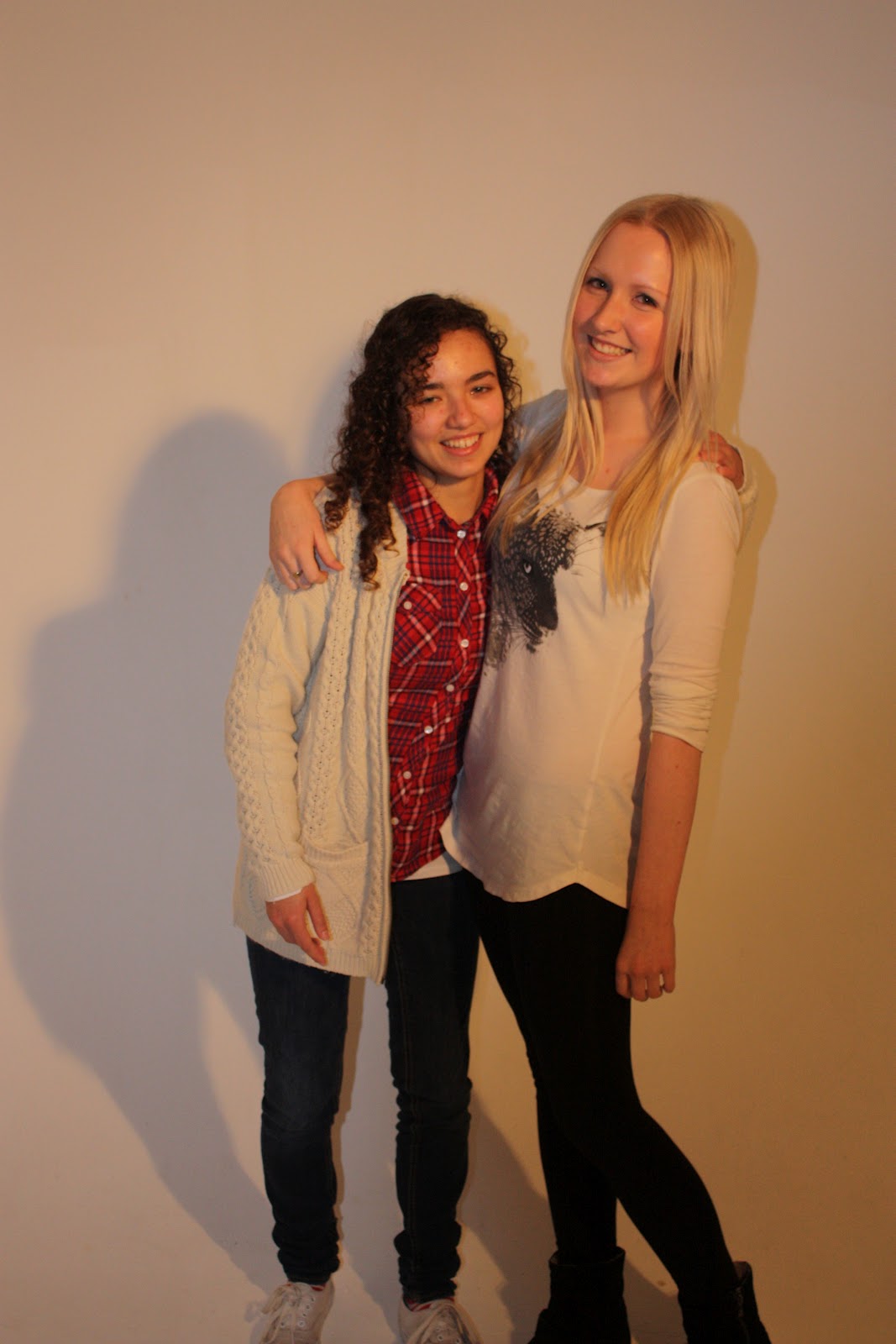
I then created another Photoshop file in the size International Paper A4 then created a radial gradient in two shades of grey. Using the quick selection tool I cut me and Mollie out of the original photo and used the refine edge tools (mostly refine radius tool) to make some of the lines look less rough and to remove some of the previous background colour from the gaps in Mollie's hair. I then copied and pasted the cut out on to my new image and added a slight drop shadow and inner shadow to make the image stand out more.


I then used the auto tone and auto colour tones to make me and Mollie's skin tones look more natural. Then using tools such as the clone stamp tool, the blur tool and the smudge tool I removed me and Mollie's imperfections. I rotated the image 90 degrees clockwise and wrote some text saying 'TAKE' in Frank Gothic Medium, size 72pt in the colour #ff96ac. Then I rotated the image back 90 degrees anticlockwise and used the text tool again, this time writing 'ONE' in Lucida Sans, size 200pt and in the colour #ff6497. Above this text I wrote "THE ONLY FILM MAGAZINE FOR FEMALES" in Lucida Sans, size 24pt and in the colour #ffffff. I added an outer and inner glow to all the text to make it stand out and it also gives imagery of bright lights which are used when creating films. The phrase 'the only film magazine for females' would encourage female readers because the word 'only' makes the magazine look exclusive and desirable. It also specifies the target audience of the magazine. I used pinks and whites for the text because this is also feminine, conveying the target audience clearly whilst appealing to them too. I then created a separate layer and cut out mine and Mollie's heads, then cut and pasted them into the new layer. I placed this layer in front of the masthead of the magazine so that mine and Mollie's heads were visible. This is a technique frequently used on magazine covers as the models on the front are important when encouraging people to buy the magazine.


I then proceeded to add a barcode with the magazine's website to the bottom right-hand corner of my magazine cover as a typical magazine convention. Then I added lots of text related to the main photo and some smaller text about other films released that month. Most of the text is pink and orange because this is a feminine colour scheme and the colours go well together whilst contrasting effectively against the images and colours I've previously used. I used black text for 'The Woman In Black' to make it match the film's title and to make it eye-catching. I used a variety of inner and outer glows and inner and drop shadows as well as many different fonts to make the magazine cover exciting and eye-catching. Other magazine conventions I added to my front cover were the price and the date that this issue is released and they are featured below the masthead so that they are easy to find. 


I think the strengths of my magazine cover are that it features all the necessary conventions of magazines such as a masthead, a slogan, models on the cover, a barcode, a price, a website and the date of the issue's release. I also used conventions of film magazines such as only using a singular image and featuring lots of text. All the articles advertised on my front cover are for films too. My idea for my film magazine is also very individual and it would be an independent magazine due to its female focus.
The weaknesses of my magazine cover are that it does not appeal to a large audience. As my target audience is so specific, it would not gain as many readers as other film magazines such as Total Film and Empire. The colour scheme I have used could also be seen as very stereotypical due to the large amount of pink and it is important to consider the types of women who may read this magazine and this colour scheme may not appeal to all of them. However, as this issue's main focus is on a romantic comedy this is acceptable. Pink is often a colour used in many young girls' magazines so my colour scheme can also be seen as a weakness because my magazine is not aimed at young girls, it is likely to be read by females aged 18- 31. 
Changes I could of possibly made to my magazine would be featuring the institution that owns my magazine to raise awareness of it. I could pay more attention to the costumes of me and Mollie on the cover; I could convey us as being more like our characters instead of ourselves personally like other film magazines. The costumes me and Mollie wore made it difficult for me to come up with an appropriate colour scheme due to the contrast in our outfits; it was hard to find colours that wouldn't match or clash badly with Mollie's red shirt.

This is my finished product:

Tuesday 20 March 2012

Magazine cover drafts

I've had a few attempts at my magazine cover and frequently changed my mind about color schemes.


 The first cover is the idea I am going to continue working on. It still has feminine themes such as females on the cover and pink text but the grey background neutralizes the cover, making it less overwhelming unlike the other two. I felt that once I'd started working on the second and third covers, it reminded me more of young girls magazines and they did not look like film magazines at all. As film magazines tend to use quite dark colors, the grey suits the audience and form of my magazine perfectly. As I continue to work on my magazine cover, I just need to add text, a bar code, a price and other typical magazine conventions. I may also do some more editing to the photo of me and mollie making it blend in more with the magazine cover.

Friday 16 March 2012

Risk assessment sheets


We used these risk assessment sheets provided by our college to consider risks and hazards we may come across when filming. We used one risk assessment sheet for each location. There were considerably more risks when we filmed on the street because we were filming in public and therefore we can not control hazards easily. Some hazards could be controlled at Joe's house such as cables but we had to be cautious about some hazards such how we were inexperienced with lighting. Overall, when we filmed no one was ever put at risk and we experienced no problems.

Wednesday 14 March 2012

Filming evaluation

In total, our group has had around 8 filming days. We have had this many film days because many problems have occurred throughout our filming.
On our first filming day, our camera ran out of battery so we couldn't do many shots. As our equipment was borrowed from our college, only they could charge it so we had to return it. On future filming days we always made sure we had a fully-charged camera. On some filming days, we'd take shots then watch them over and realise that we needed improvement on factors such as lighting, sound and camera focus. For example, in some of our shots the lighting was too dull and in others it was too bright and there were clear shadows behind the characters. Many of our shots had terrible sound but we can re-record it at college using microphones. As one time we were given a scratched camera, many of our shots came out blurry and therefore we had to re-film. There was also a lot of personal conflict; as our group is full of dominant personalities who want their ideas to be heard there were often disagreements which slowed down our filming time. 

However, our filming was successful in many ways. We had all already had experience in using the camera so there were not many problems when it came to using the camera. We also learned how to use the lighting quickly and we found it useful for many of our shots. We had no difficulty getting to our locations as they are right next to each other. We didn't take any risks we were unsure of and therefore there were no injuries. Our group also got along really well and everyone had a say in what we were doing. I was mostly being an actress during the filming so I did not get the opportunity to use the camera as much as others but I still made sure I gained experience in filming. For example, I often had a say in which shots we should try to take and I also used the camera occasionally for filming if I wasn't in the shot.

Trailer planning

When creating this film trailer it is important to convey the genre, the basic storyline and the Beatles theme of the film clearly.

To convey the genre, we have to feature romantic and comedic shots. Romantic shots could include Paul and Lucy/Stella doing conventional couple activities such as holding hands, clearly showing that they are romantically linked and comedic shots can show funny moments in the film which would make the audience laugh. By doing this we are giving the audience a clear understanding of the genre.

The storyline can be conveyed by putting shots in the same order as they take place in the film, displaying how the characters' lives were before then showing the conflict that occurred which changed everything. We will not show the ending so that the audience will not know what happens next and this will make them eager to see the film.

The Beatles theme will be conveyed through the clear Beatles theme conveyed in many of the shots such as the shots where Paul's poster of The Beatles is visible and when Paul wears his t-shirt of The Beatles. We are also using songs by The Beatles in our trailer.

We will be creating our film trailer on Final Cut Pro which I have experienced using last year. I am unsure of what fonts we will be using in the film and what transitional effects to use in-between shots but this will all be decided when we begin our editing as we need to see what looks good. We are featuring a split-screen technique in our trailer when Paul and Lucy are on the phone, similarly to The Holiday's trailer. I will be using this editing time to refresh my skills from last year as well as learning new ones such as how to use a split-screen technique. My film is also a different genre to what it was last year; last year my film was a drama and this year it is a romantic comedy so the transitions, music and text will all differ to last year.

Film poster planning

When we did our photoshoot, our photos were inspired by the Bridget Jones film posters.


As I have previously said, we chose this film poster as our inspiration because in the film the female protagonist has two romantic interests, similarly to Paul in our film.

My poster is going to be in a landscape format featuring a close-up shot of Paul, Lucy and Stella. The title of my film will be shown across the top in a similar style font to the Beatles logo so that the Beatles theme of the film is clearly conveyed. The title will be in mostly black to match Paul's suit but the word love will be written in red because that will symbolise the romance genre of the film. Paul will be in the centre of the poster conveying he is the protagonist of the film and the way Lucy and Stella face Paul and stand close to him will convey the relationship between the two girls and Paul. The names of the three characters on the poster will be shown at the bottom in black writing and in a sans serif font. Below the title, the film's slogan will be shown in a light pink font so it contrasts against the coral pink background as well as conveying the romance genre. As my film poster would be released before the film is, my poster will include the film's release date in a bold, black font so it stands out and it will also be written in The Beatles font. Information which is conventionally shown on all film posters such as details about the film's production (in a black, tall and thin font), the film's Facebook, the BBFC rating and the film's production company's logo will be at the bottom of the poster underneath the actresses as well as who directed and edited the film. I will also feature the Facebook logo and the name of the Facebook fan page for the film. The Facebook fan page will be shown to encourage the audience to look on these websites and learn more about the film so they will be interested in seeing it. By 'liking' the Facebook page, this would also raise awareness of the film to even more people. 

Friday 9 March 2012

Female magazine research

I have read many different magazines in my life aimed at females from gossip magazines like Heat to more upmarket magazines like Vogue. The most popular types of female magazines are gossip magazines as they are cheap, usually published weekly (so they are up to date) and easy to purchase from many shops. There are no film magazines around that would particularly attract females so this magazine would be independent and would be likely to attract a large audience. I have chosen to look at Heat and Glamour magazines; 2 different magazines with differing audiences. This will help me develop an understanding of which sort of magazine I should make my film magazine similar to. I will compare audience profiles from these 2 magazines to those of a film magazine to decide which sort of audience would be best to aim for.

1. Heat
 

Audience profile (taken from Heat magazine's website): ABC1 women aged 16-35 who are obsessed with celebrity gossip. Typical heat readers are in their mid twenties – social butterflies with a career that’s on the up. They are incredibly entertainment literate: avid cinema-goers, DVD-renters, internet-users, music-lovers, TV-addicts. They are smart and prolific shoppers especially when it comes to beauty & fashion products. In fact, shopping is one of their key precious leisure activities and high street fashion, in particular, is supremely important to them.

The way this profile mentions 'cinema-goers' and 'DVD-renters' has got my attention. This is the readership I would expect my film magazine to have. The age group is 16- 35 which is also the target audience of our film. I have selected a Twilight special of Heat magazine to analyse so I can gather as many ideas as possible. There are lots of bold colours and eye-catching fonts and photos all over the cover which would easily catch the audience's eye. The colours also contrast significantly making all the text bold and easy to read. It advertises it's enticements on the cover (film preview tickets) which would encourage the reader to buy the magazine so they can find out how to win. In contrast to film magazines, there are more images than text. For film magazines, there is always a limited number of photos and lots of text.
 
2. Glamour
Audience profile for Glamour's website (according to Condé Nast's website):
  • Female: 90%   

  • Average Age: 31   

  • ABC1: 73%   

  • Average Net HHI: £37,335

  •  
    This clearly shows that this magazine's main focus is fashion. The average age being 31 only just allows the reader to fit into my film's target audience. The colours on the cover are very soft and feminine clearly conveying the target audience.However, this colour scheme is also eye-catching because the colours contrast against the white background. Glamour also differs to Heat because there is only one photo surrounded by lots of text, similarly to a film magazine which also tends to have more text than photos.

    I will combine elements of these two magazines when designing my magazine. I will feature elements from the Glamour magazine cover such as one photo with lots of text and the soft, feminine colour scheme. From Heat magazine, I will use the same language but adapt it to my magazine so it is purely about films and gossip behind-the-scenes. I am also going to feature a competition enticement on the cover of my magazine to encourage readers to buy the magazine and enter the competition.

    Film poster research

    I have been looking on www.imdb.com at some romantic comedies and their film posters to get inspiration for my film poster. I thought it would be best if I looked at the 'Highest Rated Comedy Feature Films With At Least 1,000 Votes' and 'Highest Rated Romance Feature Films With At Least 1,000 Votes' so I can analyse and get inspiration from successful romantic comedies' posters. These 2 of the most popular romantic comedies according to IMDB:

    1. Forrest Gump (1997)
    Plot summary (taken from IMDB): Forrest, Forrest Gump is a simple man with a low IQ but good intentions. He is running through childhood with his best and only friend Jenny. His 'mama' teaches him the ways of life and leaves him to choose his destiny. Forrest joins the army for service in Vietnam, finding new friends called Dan and Bubba, he wins medals, creates a famous shrimp fishing fleet, inspires people to jog, starts a ping-pong craze, create the smiley, write bumper stickers and songs, donating to people and meeting the president several times. However this is all irrelevant to Forrest who can only think of his childhood sweetheart Jenny. Who has messed up her life. Although in the end all he wants to prove is that anyone can love anyone.

    This film poster features a convention of romantic comedy film posters; a park bench. Considering he is sitting by himself, this poster does convey part of the plot which is that he spends alot of the film alone. However, by looking at this poster it is impossible to tell that this is a romantic comedy. There's no female on the poster and the man is not making any sort of romantic gesture which could convey that he's in love. Elements of comedy are not particularly clear either. The poster is vague but this can be a good or bad thing. It can be good because it reveals very little about the storyline so the audience would wonder what happens in the film but it can also be bad because there is a lack of an insight into the film which may not be very enticing for an audience.

    2. Amelie (2001)


    Film summary (taken from IMDB): Amélie is a story about a girl named Amélie whose childhood was suppressed by her Father's mistaken concerns of a heart defect. With these concerns Amélie gets hardly any real life contact with other people. This leads Amélie to resort to her own fantastical world and dreams of love and beauty. She later on becomes a young woman and moves to the central part of Paris as a waitress. After finding a lost treasure belonging to the former occupant of her apartment, she decides to return it to him. After seeing his reaction and his new found perspective - she decides to devote her life to the people around her. Such as, her father who is obsessed with his garden-gnome, a failed writer, a hypochondriac, a man who stalks his ex girlfriends, the "ghost", a suppressed young soul, the love of her life and a man whose bones are as brittle as glass. But after consuming herself with these escapades - she finds out that she is disregarding her own life and damaging her quest for love. Amélie then discovers she must become more aggressive and take a hold of her life and capture the beauty of love she has always dreamed of.

    Similarly to Forrest Gump, it is hard to tell that this film is a romantic comedy. However, from first impressions I think it looks like a fantasy film which is one of its genres. This particular poster for this film is enticing because it mentions the amount of awards it's won as well as a positive review. The actress on the poster is wearing red clothing with red lipstick. The colour red gives connotations of love, danger and anger so I'm assuming in this situation it is conveying love. The slogan of the film, 'She'll change your life' is also open to interpretation as an audience. The audience would not know what this means but due to the large amount of red the actress is wearing it is likely to convey romance. However, the contrasting green background could make an audience assume otherwise. The colour green has connotations of sickness so this could convey that this woman will change the audience's life for the worst. The actress also engages eye contact with the camera lense, creating a connection between her and the audience which is captivating. The mystery of this film poster is likely to attract an audience, especially with its positive review and the acknowledgement of the film's awards.

    I feel that although these films have been successful, they do not convey elements of romantic comedy enough so I have researched a few more recent romantic comedies on IMDB:

    3. This Means War (2012)


    Film summary (taken from IMDB): Two CIA agents, Tuck and Frank who are also best friends, have been benched because someone's after them. Tuck is divorced with a son whom he's not close to and Frank is a ladies man. Tuck decides to try and find someone so he places his profile on a dating website. Lauren, a woman also looking for a guy sees tuck's profile and goes with him. She later bumps into Frank and he hits on her and she goes out with him. she's intrigued by both of them. When they learn that they're dating the same girl, they agree to let her choose. But both can't help but use their skills to keep tabs on her and each other. And also sabotage each others dates with her.

    Similarly to our film, the poster clearly conveys that there is one character pursuing two different love interests. This is clearly shown by the actress being placed in the middle and the two male romantic interests on either side of her. This therefore clearly shows that this film fits into the romance genre. Once again, the comedy genre isn't clear. The slogan, 'spy against spy', conveys that the two men either side of her are spies who are fighting for this woman. Furthermore, this is also conveyed through the use of props; both men are holding guns aimed at each other. The use of the actors' eye contact engages the audience so they feel drawn to the film. The red font also conveys the romance aspect of this film as red has connotations of romance. The white font also effectively contrasts with the black and white image used in the background as well as the other red writing. The actresses' clothing also clearly shows that she is the woman these two men are pursuing because she is dressed in a tight, revealing dress making her attractive to the audience.

    4. Wanderlust

    Film summary (taken from IMDB): Rattled by sudden unemployment, a Manhattan couple surveys alternative living options, ultimately deciding to experiment with living on a rural commune where free love rules.

    Unlike the previous film posters I have analysed, this poster conveys elements of the comedy genre. The actors' confused facial expressions can be seen as humorous, they are not serious or just happy like the other film posters. This poster also clearly conveys the romance genre because it features a man and a woman standing close together and holding hands. The way they are standing in front of an overgrown sunflower field makes the audience wonder why they are there, especially considering they are wearing formal clothing that you would perhaps expect people to wear in an office job. This would draw the audience in because of the mystery behind this poster; they would want to know what is going on. The film poster has a very summery theme to it with the yellow fonts, the blue sky, the green grass and the sunflowers so this film suits its release date; just before Spring 2012. An audience may also be attracted to this because this film is actually released in winter and it is unlikely that they would of seen a sunny day in a while; it's escapism for them.

    All these film posters feature some sort of credits at the bottom. They usually feature the film's production company, the directors, the actors/actresses, the film's release date and it's BBFC rating. These are all in a much smaller font so it doesn't disract the audience from the main focus of the poster. This would also encourage the audience to move closer to the poster and read more. Film posters need to be eye-catching and captivating as well as informative of the film's genre and storyline. Awards and positive reviews can be included as further enticements after the film has had some views.

    Wednesday 7 March 2012

    Film poster photo ideas

    Our group found a website with an article on typical romantic comedy poster clichés.
    http://www.empireonline.com/features/romantic-comedy-movie-poster-cliches/p1

    We have found this useful when planning our photos for our film posters. The ideas we particularly like are 'Cliché #2: The Three Floaty Faces', 'Cliché #3: The Park Bench' and '#5: The Collage'.


    We think the 'Three Floaty Faces' is appropriate because it can feature 3 heads; Paul, Lucy and Stella. If we were going to use this shot we would place Paul in the middle, conveying that he is having to choose between Lucy and Stella. The characters can make eye contact with the camera lens too which would captivate the potential audience. It clearly conveys the characters and the positioning of the characters can convey a lot about the characters. For example, if they faced the centre character it would show attraction whereas if they faced away it would give the opposite effect.

    "The Park Bench" would be good because we have a few scenes set outdoors on chairs so this would give the audience an insight into the film's settings. Once again, the positioning of the characters can also convey a lot. If they sit close together it shows closeness emotionally whereas if they sat further away from each other it could convey shyness or dislike towards the other character. However, for this shot we may only be able to use 2 actors because 3 actors would look crowded and this wouldn't convey the storyline of the film clearly enough.

    "The Collage" is a good idea because you can fit many characters and scenes onto the poster giving a large insight into the film's characters and settings. However, this would make it difficult to give the audience an insight into the actual storyline due to the large amount of images instead of one clear picture summarizing the film.

    The "Three Floaty Heads" idea seems most suitable because it suits our film better than the other ideas do. We can place Paul in the middle with Lucy and Stella on either side of him. The characters can all stand close together conveying closeness and the two girls can face Paul with their bodies showing their attraction to him. These photos can easily be taken in a photography studio in our college which is easily acceptable instead of having to relocate. 

    Magazine cover planning

    My magazine's target audience will be females who love films which is unusual because there are no British film magazines specifically aimed at women. I am naming my magazine "Take One" because this is a quote used when creating films and therefore it is relevant. There are also no other film magazines with this name. It's going to focus on films that are aimed at females and films that are aimed at both genders but the films will be written about what aspects of films women are interested in. As women tend to like the gossip, my magazine will cover the film and the actual actors'/actresses' behind-the-scenes gossip from the film set. My film
    The masthead of the magazine will be pink as I do not want it to match with the background colors too much and also pink is a color which is associated with femininity and romance which is the theme of the film cover. As we will be doing our photoshoot in a professional photography studio our background of our photos will be neutral and therefore this will allow me to use the magnetic lasso tool and quick selection tools on Photoshop with no difficulties. I will then put the photo over a plain colored background with a gradient of two different shades of silvers this is a color which appeals to females and my magazine is aimed at females. All the other text will be a variety of different colours with a slight shadow underneath to make the text stand out against the background. I am using myself and Mollie (Lucy and Stella) on the front cover of the magazine as by using females on my cover it conveys that my magazine is aimed at females. I am going to use a medium shot as this is a typical convention of film magazines. I will wear white like my character does in the film and Mollie will wear red like her character. As me and Mollie are friends in reality, the film cover will change the reader's typical idea of the actresses' relationship as in the film we would not like each other due to Paul. Me and Mollie's relationship will look more positive with happy body language. As our film is released in January 2012, the magazine will be released in January too. The magazine will be released on the 4th January 2012 and the magazine cover will feature our film and other films that are released in February 2012 such as The Woman In Black, Wanderlust, Big Miracle and The Vow which are all female-friendly and 2 of them are romantic comedies. They will be shown in smaller headings in colors that suit their genre. The Woman In Black would be in black (play on the name of the film) and red as it's a thrillar/drama/horror,  Wanderlust, Big Miracle and The Vow will be in pink as they are lighthearted films. I will also feature typical magazine conventions such as the date, the price (£3.95 as this is in the same price range as Empire and Total Film magazines), the barcode and the magazine's website. The institution which owns the magazine will be Bauer (the institution that owns the film magazine, Empire, as well as many magazines aimed at females such as Heat, Closer and Grazia).

    Tuesday 6 March 2012

    Photoshoot

    We had our photoshoot for our magazine cover and our film poster on 24th January 2012. We took our photos using a Canon EOS 450D and used myself, Mollie and Josh as models.

    First of all we took the photos of Josh by himself. We positioned him in a way which is frequently used for film magazine covers; he faced the camera and made eye contact with the lens for most of the shots and we used a medium shot. He wore a suit which was meant to look similar to The Beatles' clothing to make the theme of our film clear.


    Next we took the photos for my magazine cover using medium shots, medium close-ups and long shots. As my magazine is aimed at females, I used me and Mollie on the cover and I made sure me and Mollie made eye contact with the lens to engage the reader. The actual article in the magazine would focus on the film and the gossip behind the scenes and the magazine cover conveys that me and Mollie are actually friends in reality and not opposing each other like we do in the film. This is reflected through the photos; me and Mollie took photos that conveyed our friendship through our use of posture and body language. Our clothes convey the characters' personality again; Mollie wears red because her character is seen as bad and a threat and I wore white because my character is seen as innocent.


    For our final images we took photos of me, Mollie and Josh using medium long shots, close-ups and long shots. These images were inspired by the Bridget Jones film posters which is a well known romantic comedy. 


    We chose this film poster as our inspiration because in the film the female protagonist has two romantic interests, similarly to Paul in our film. We experimented with a few different types of shots so that we had plenty to choose from in case we had issues with facial expressions, posture and lighting or if we decided we wanted to use different shots. Once again, we all made eye contact with the camera to captivate the audience as well as clearly conveying the genre of our film through our positioning and our costume.